Preprocessing scRNA-seq data with Scanpy
Author: Hugo Chenel
Purpose: This tutorial guides researchers through preprocessing single-cell RNA-seq (scRNA-seq) data using Scanpy, a fast and scalable Python toolkit. It covers quality control, normalization, clustering and cell type annotation.
Compared to Seurat, Scanpy offers better performance on large datasets, faster computations and seamless integration with the Python data science and machine learning ecosystem.
Introduction
This tutorial demonstrates a complete single-cell RNA-sequencing (scRNA-seq) analysis workflow using the 10k Peripheral Blood Mononuclear Cells (PBMC) dataset from 10x Genomics. The pipeline leverages Scanpy and related tools for preprocessing, dimensionality reduction, clustering and annotation of cell types.
We walk through:
- Quality control and filtering
- Normalization and identification of highly variable genes
- PCA and neighborhood graph construction
- Clustering using Leiden and Louvain algorithms
- Marker gene detection and manual cell type annotation
- Visualization using UMAP, dotplots and heatmaps
The goal is to reproduce a biologically meaningful cellular map and identify major immune cell populations within the PBMC sample.
Setup
Import packages
# Install specific package versions
# !pip install scanpy==1.9.6 anndata==0.10.3 numpy==2.2.5 pandas>=1.4 matplotlib>=3.5 seaborn>=0.11 igraph==0.11.6 louvain==0.8.2

import scanpy as sc
import anndata
import numpy as np
import pandas as pd
import matplotlib
import matplotlib.pyplot as plt
import seaborn as sns
import igraph as ig
import louvain

# Print library versions
for lib in [sc, anndata, np, pd, matplotlib, sns, ig, louvain]:
    print(f"{lib.__name__}: {lib.__version__}")

# Configure scanpy settings for optimal performance
sc.settings.verbosity = 3
sc.settings.set_figure_params(dpi=100, facecolor='white')
scanpy: 1.11.1
anndata: 0.11.4
numpy: 2.2.5
pandas: 2.2.3
matplotlib: 3.10.3
seaborn: 0.13.2
igraph: 0.11.6
louvain: 0.8.2Download PBMC dataset
Downloading and extraction of the PBMC 10k v3 dataset from 10x Genomics.
We use the PBMC 10k v3 dataset from 10x Genomics, a well-characterized single-cell RNA-seq dataset derived from ~10,000 peripheral blood mononuclear cells (PBMCs) collected from a healthy human donor. This dataset is commonly used for benchmarking and method development in single-cell analysis.
- Format: 10x Genomics filtered_feature_bc_matrix
- Contents: matrix.mtx.gz, features.tsv.gz, barcodes.tsv.gz
- Location: data/filtered_feature_bc_matrix/
# Create a directory to store the dataset
!mkdir -p data

# Download the dataset
!wget -P data https://cf.10xgenomics.com/samples/cell-exp/3.0.0/pbmc_10k_v3/pbmc_10k_v3_filtered_feature_bc_matrix.tar.gz

# Extract it
!tar -xzf data/pbmc_10k_v3_filtered_feature_bc_matrix.tar.gz -C data
Load data into AnnData
Loads the PBMC 10k dataset into an AnnData object using gene symbols as variable names, ensures uniqueness and stores the original data in raw for later reference.
# Load 10x Genomics formatted data
adata = sc.read_10x_mtx(
    "data/filtered_feature_bc_matrix",
    var_names='gene_symbols',  # Use gene symbols for gene names
    cache=True  # Write a cache file for faster subsequent reading
)

# Make variable names unique
adata.var_names_make_unique()
adata.raw = adata
adata
... reading from cache file cache/data-filtered_feature_bc_matrix-matrix.h5adAnnData object with n_obs × n_vars = 11769 × 33538
var: 'gene_ids', 'feature_types'# Print summary of the AnnData object
print(adata)
# Number of cells (observations)
print(f"Number of cells: {adata.n_obs}")
# Number of genes (variables)
print(f"Number of genes: {adata.n_vars}")
# Preview first few cell (obs) and gene (var) names
print(f"First 5 cell IDs: {adata.obs_names[:5].tolist()}")
print(f"First 5 gene names: {adata.var_names[:5].tolist()}")
# Matrix sparsity info
nonzero = (adata.X != 0).sum()
total = adata.shape[0] * adata.shape[1]
print(f"Data sparsity: {(1 - nonzero / total):.2%}")AnnData object with n_obs × n_vars = 11769 × 33538
var: 'gene_ids', 'feature_types'
Number of cells: 11769
Number of genes: 33538
First 5 cell IDs: ['AAACCCAAGCGCCCAT-1', 'AAACCCAAGGTTCCGC-1', 'AAACCCACAGAGTTGG-1', 'AAACCCACAGGTATGG-1', 'AAACCCACATAGTCAC-1']
First 5 gene names: ['MIR1302-2HG', 'FAM138A', 'OR4F5', 'AL627309.1', 'AL627309.3']
Data sparsity: 93.71%Quality control
This section annotates mitochondrial, ribosomal and hemoglobin genes, calculates cell-level QC metrics, and visualizes distributions and scatter plots to inspect potential low-quality cells.
Quality control metrics
# Annotate mitochondrial, ribosomal, and hemoglobin genes
adata.var['mt'] = adata.var_names.str.startswith('MT-')      # Mitochondrial genes
adata.var['ribo'] = adata.var_names.str.startswith(('RPS', 'RPL'))  # Ribosomal genes
adata.var['hb'] = adata.var_names.str.startswith('HB')       # Hemoglobin genes

print(f"Mitochondrial genes: {adata.var['mt'].sum()}")
print(f"Ribosomal genes: {adata.var['ribo'].sum()}")
print(f"Hemoglobin genes: {adata.var['hb'].sum()}")

# Compute QC metrics using these annotations
sc.pp.calculate_qc_metrics(
    adata,
    qc_vars=['mt', 'ribo', 'hb'],
    percent_top=None,
    log1p=False,
    inplace=True
)

# Visualize QC metrics
sc.pl.violin(adata, ['n_genes_by_counts', 'total_counts', 'pct_counts_mt'],
             jitter=0.4, multi_panel=True)

fig, ax = plt.subplots(1, 2, figsize=(10, 4))
sc.pl.scatter(adata, x='total_counts', y='pct_counts_mt', ax=ax[0], show=False)
sc.pl.scatter(adata, x='total_counts', y='n_genes_by_counts', ax=ax[1], show=False)
plt.tight_layout(); plt.show()


print("\nQC metrics calculated:")
print(f"QC columns in adata.obs: {[col for col in adata.obs.columns if 'total' in col or 'pct' in col or 'n_genes' in col]}")

# Basic statistics
print(f"\nBasic statistics:")
print(f"Mean genes per cell: {adata.obs['n_genes_by_counts'].mean():.2f}")
print(f"Mean UMIs per cell: {adata.obs['total_counts'].mean():.2f}")
print(f"Mean mitochondrial percentage: {adata.obs['pct_counts_mt'].mean():.2f}%")
if 'pct_counts_ribo' in adata.obs.columns:
    print(f"Mean ribosomal percentage: {adata.obs['pct_counts_ribo'].mean():.2f}%")
Mitochondrial genes: 13
Ribosomal genes: 104
Hemoglobin genes: 13QC metrics calculated:
QC columns in adata.obs: ['n_genes_by_counts', 'total_counts', 'total_counts_mt', 'pct_counts_mt', 'total_counts_ribo', 'pct_counts_ribo', 'total_counts_hb', 'pct_counts_hb']
Basic statistics:
Mean genes per cell: 2109.42
Mean UMIs per cell: 7644.85
Mean mitochondrial percentage: 11.99%
Mean ribosomal percentage: 25.85%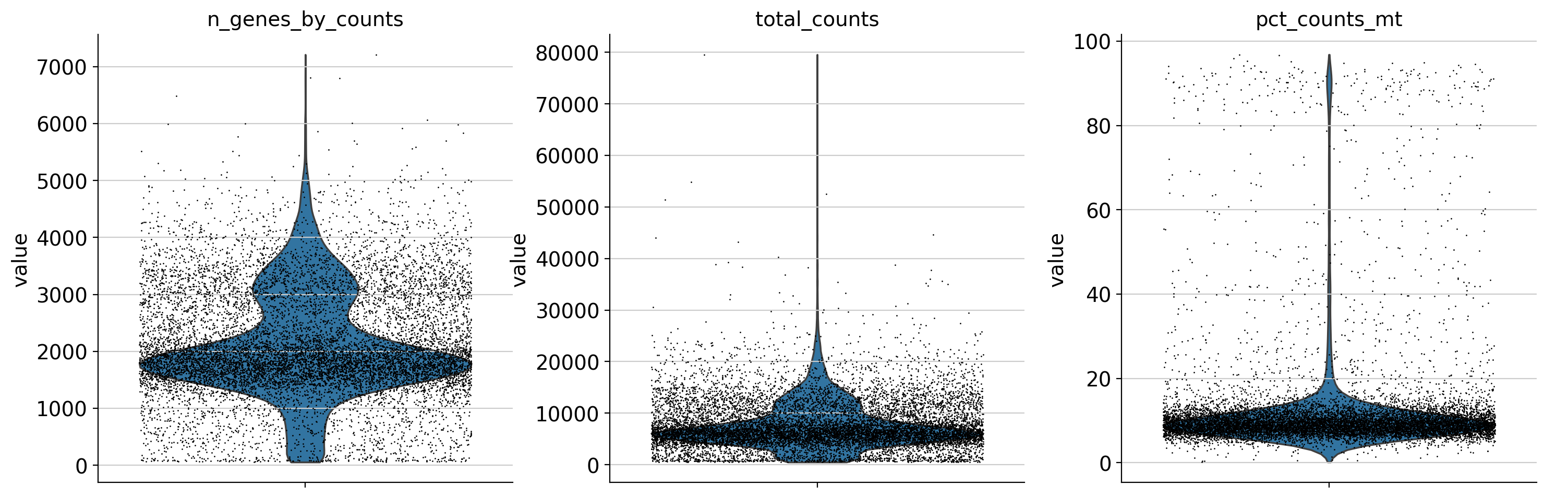
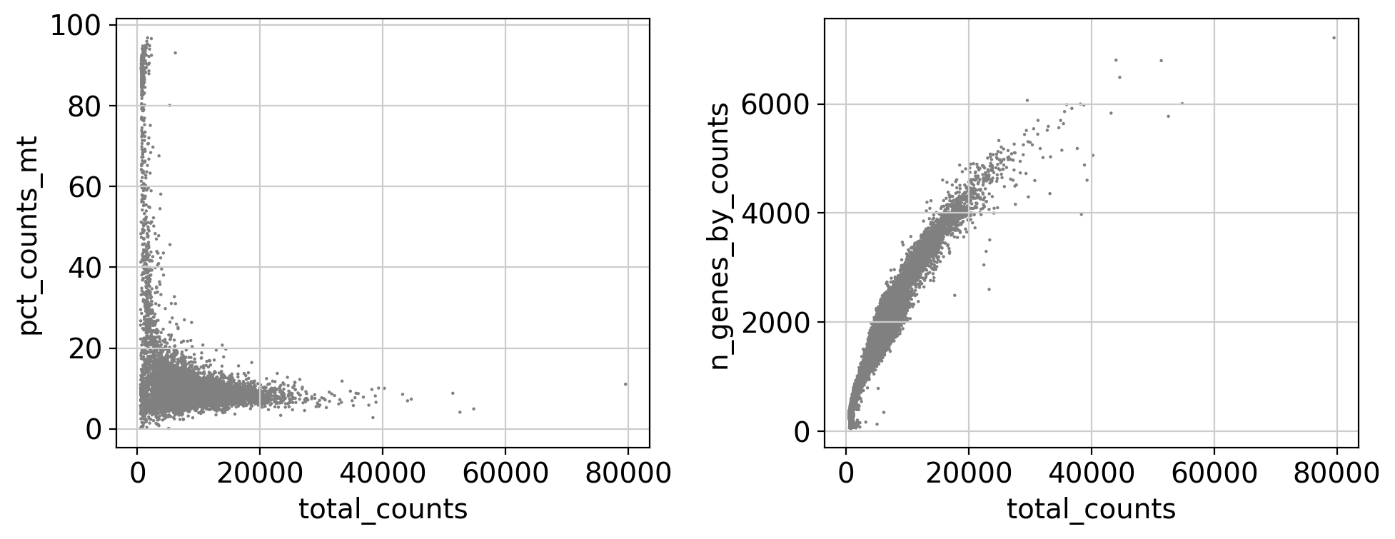
We annotated key gene types (mitochondrial, ribosomal, hemoglobin) and computed standard QC metrics using scanpy. These metrics are visualized using violin and scatter plots.
-
Violin plots show distribution of:
- Number of detected genes per cell
- Total UMI counts per cell
- Mitochondrial gene percentage
-
Scatter plots help detect:
- Cells with high total counts and high mitochondrial content (likely stressed/dying)
- Cells with unusually low gene counts (likely empty droplets)
These diagnostics guide threshold selection for filtering low-quality or outlier cells in the next step.
Quality control filtering
We applied rigorous quality filters to retain high-confidence single cells and informative genes:
-
Gene filter: kept genes expressed in at least 3 cells.
-
Cell filter:
n_genes_by_counts > 500: remove empty droplet< 5000: avoid doubletspct_counts_m < 15%: exclude stressed/dying cellstotal_counts between 1000 and 30 000: keep healthy transcriptional profiles
Gene-level statistics (number of cells expressed in, mean count, dropout rate) are recomputed after filtering to verify dataset quality.
# Print initial statistics
print(f"Before filtering:")
print(f"  Cells: {adata.n_obs}")
print(f"  Genes: {adata.n_vars}")

# Basic gene filter: keep genes expressed in at least 3 cells
sc.pp.filter_genes(adata, min_cells=3)

# Cell-level QC filtering
adata = adata[
    (adata.obs['n_genes_by_counts'] > 500) & # Remove cells with too few genes (likely empty droplets)
    (adata.obs['n_genes_by_counts'] < 5000) & # Remove cells with too many genes (potential doublets)
    (adata.obs['pct_counts_mt'] < 15) & # Remove cells with high mitochondrial content (stressed/dying)
    (adata.obs['total_counts'] > 1000) & # Remove low-UMI cells (low-quality)
    (adata.obs['total_counts'] < 30000),
    :
]

# Optional stricter PBMC-style filters
# adata = adata[adata.obs['n_genes_by_counts'] < 2500, :]
# adata = adata[adata.obs['pct_counts_mt'] < 10, :]

# Final cleanup (redundant with earlier gene filtering, but safe to repeat)
sc.pp.filter_genes(adata, min_cells=3)
sc.pp.filter_cells(adata, min_genes=500)

# Calculate gene statistics
adata.var['n_cells'] = (adata.X > 0).sum(axis=0).A1
adata.var['mean_counts'] = adata.X.mean(axis=0).A1
adata.var['pct_dropout'] = 100 * (1 - adata.var['n_cells'] / adata.n_obs)

print(f"\nGene statistics:")
print(f"  Mean cells per gene: {adata.var['n_cells'].mean():.2f}")
print(f"  Mean counts per gene: {adata.var['mean_counts'].mean():.2f}")
print(f"  Mean dropout percentage: {adata.var['pct_dropout'].mean():.2f}%")

print(f"\nFinal filtered data:")
print(f"  Cells: {adata.n_obs}")
print(f"  Genes: {adata.n_vars}")
Before filtering:
Cells: 11769
Genes: 33538
filtered out 13245 genes that are detected in less than 3 cells
filtered out 186 genes that are detected in less than 3 cellsGene statistics:
Mean cells per gene: 1169.56
Mean counts per gene: 0.40
Mean dropout percentage: 88.87%
Final filtered data:
Cells: 10508
Genes: 20107# Create a figure with subplots
fig, axes = plt.subplots(2, 3, figsize=(18, 12))
fig.suptitle('Quality control metrics', fontsize=16, y=0.98)
# Plot 1: Number of genes per cell (violin plot)
axes[0,0].violinplot([adata.obs['n_genes_by_counts']], positions=[0], showmeans=True, showmedians=True)
axes[0,0].set_ylabel('Number of genes')
axes[0,0].set_title('Genes per cell')
axes[0,0].set_xticks([0])
axes[0,0].set_xticklabels(['Cells'])
# Plot 2: Total UMI counts per cell (violin plot)
axes[0,1].violinplot([adata.obs['total_counts']], positions=[0], showmeans=True, showmedians=True)
axes[0,1].set_ylabel('Total UMI counts')
axes[0,1].set_title('UMI counts per cell')
axes[0,1].set_xticks([0])
axes[0,1].set_xticklabels(['Cells'])
# Plot 3: Mitochondrial gene percentage (violin plot)
axes[0,2].violinplot([adata.obs['pct_counts_mt']], positions=[0], showmeans=True, showmedians=True)
axes[0,2].set_ylabel('Mitochondrial gene %')
axes[0,2].set_title('Mitochondrial gene %')
axes[0,2].set_xticks([0])
axes[0,2].set_xticklabels(['Cells'])
# Plot 4: Scatter plot - genes vs UMIs
axes[1,0].scatter(adata.obs['total_counts'], adata.obs['n_genes_by_counts'], alpha=0.6, s=1)
axes[1,0].set_xlabel('Total UMI counts')
axes[1,0].set_ylabel('Number of genes')
axes[1,0].set_title('Genes vs UMI counts')
# Plot 5: Scatter plot - UMIs vs mitochondrial %
axes[1,1].scatter(adata.obs['total_counts'], adata.obs['pct_counts_mt'], alpha=0.6, s=1)
axes[1,1].set_xlabel('Total UMI counts')
axes[1,1].set_ylabel('Mitochondrial gene %')
axes[1,1].set_title('UMI counts vs Mitochondrial %')
# Plot 6: Ribosomal gene percentage (violin plot)
axes[1,2].violinplot([adata.obs['pct_counts_ribo']], positions=[0], showmeans=True, showmedians=True)
axes[1,2].set_ylabel('Ribosomal gene %')
axes[1,2].set_title('Ribosomal gene %')
axes[1,2].set_xticks([0])
axes[1,2].set_xticklabels(['Cells'])
#plt.tight_layout()
#qc_plot_path = os.path.join(output_dir, 'qc_metrics.png')
#plt.savefig(qc_plot_path, dpi=300, bbox_inches='tight')
#plt.close()
#print(f"QC metrics plot saved at: {qc_plot_path}")
# Summary statistics
print("\nDetailed QC statistics:")
print("=" * 50)
for metric in ['n_genes_by_counts', 'total_counts', 'pct_counts_mt', 'pct_counts_ribo']:
if metric in adata.obs.columns:
data = adata.obs[metric]
print(f"{metric}:")
print(f" Mean: {data.mean():.2f}")
print(f" Median: {data.median():.2f}")
print(f" Std: {data.std():.2f}")
print(f" Min: {data.min():.2f}")
print(f" Max: {data.max():.2f}")
print()Detailed QC statistics:
==================================================
n_genes_by_counts:
Mean: 2238.32
Median: 1969.00
Std: 818.91
Min: 501.00
Max: 4986.00
total_counts:
Mean: 8088.38
Median: 6806.00
Std: 4109.33
Min: 1001.00
Max: 29732.00
pct_counts_mt:
Mean: 9.06
Median: 8.88
Std: 2.14
Min: 0.39
Max: 15.00
pct_counts_ribo:
Mean: 27.66
Median: 28.32
Std: 10.81
Min: 0.72
Max: 53.15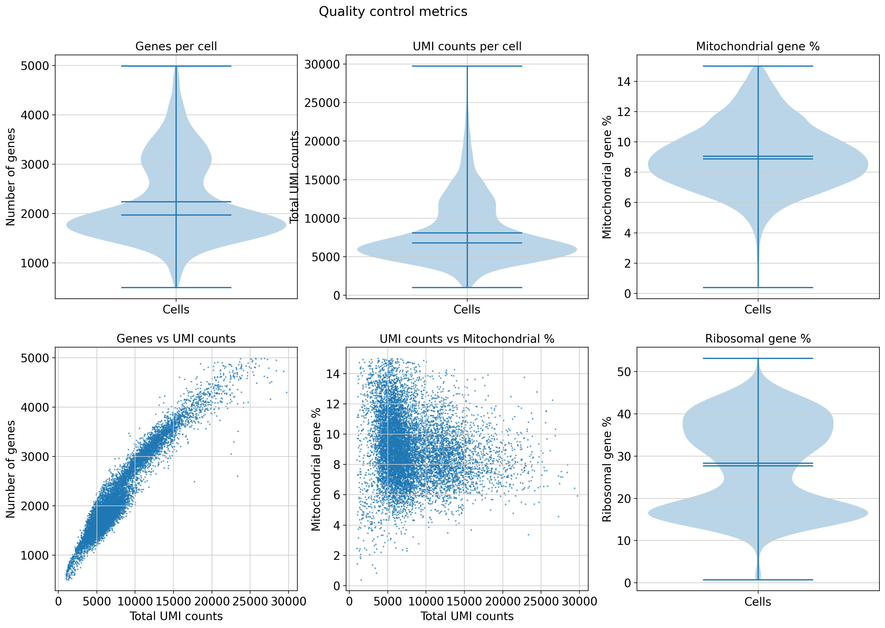
Normalization, scaling and HVGs
# Normalize and log-transform the data
sc.pp.normalize_total(adata, target_sum=1e4) # Normalize to 10,000 counts per cell
sc.pp.log1p(adata) # Log-transform

# Identify highly variable genes (HVGs) for downstream analysis
sc.pp.highly_variable_genes(adata, min_mean=0.0125, max_mean=3, min_disp=0.5)

# Visualize HVGs
plt.figure(figsize=(8, 4))
sc.pl.highly_variable_genes(adata, show=False)
plt.title('Highly variable genes')

# Subset the data to keep only highly variable genes
adata = adata[:, adata.var.highly_variable]

# Regress out unwanted sources of variation (technical effects)
sc.pp.regress_out(adata, ['total_counts', 'pct_counts_mt'])

# Scale each gene to unit variance and zero mean; clip extreme values
sc.pp.scale(adata, max_value=10)
normalizing counts per cell
finished (0:00:00)
extracting highly variable genes
finished (0:00:00)
--> added
'highly_variable', boolean vector (adata.var)
'means', float vector (adata.var)
'dispersions', float vector (adata.var)
'dispersions_norm', float vector (adata.var)
regressing out ['total_counts', 'pct_counts_mt']
sparse input is densified and may lead to high memory use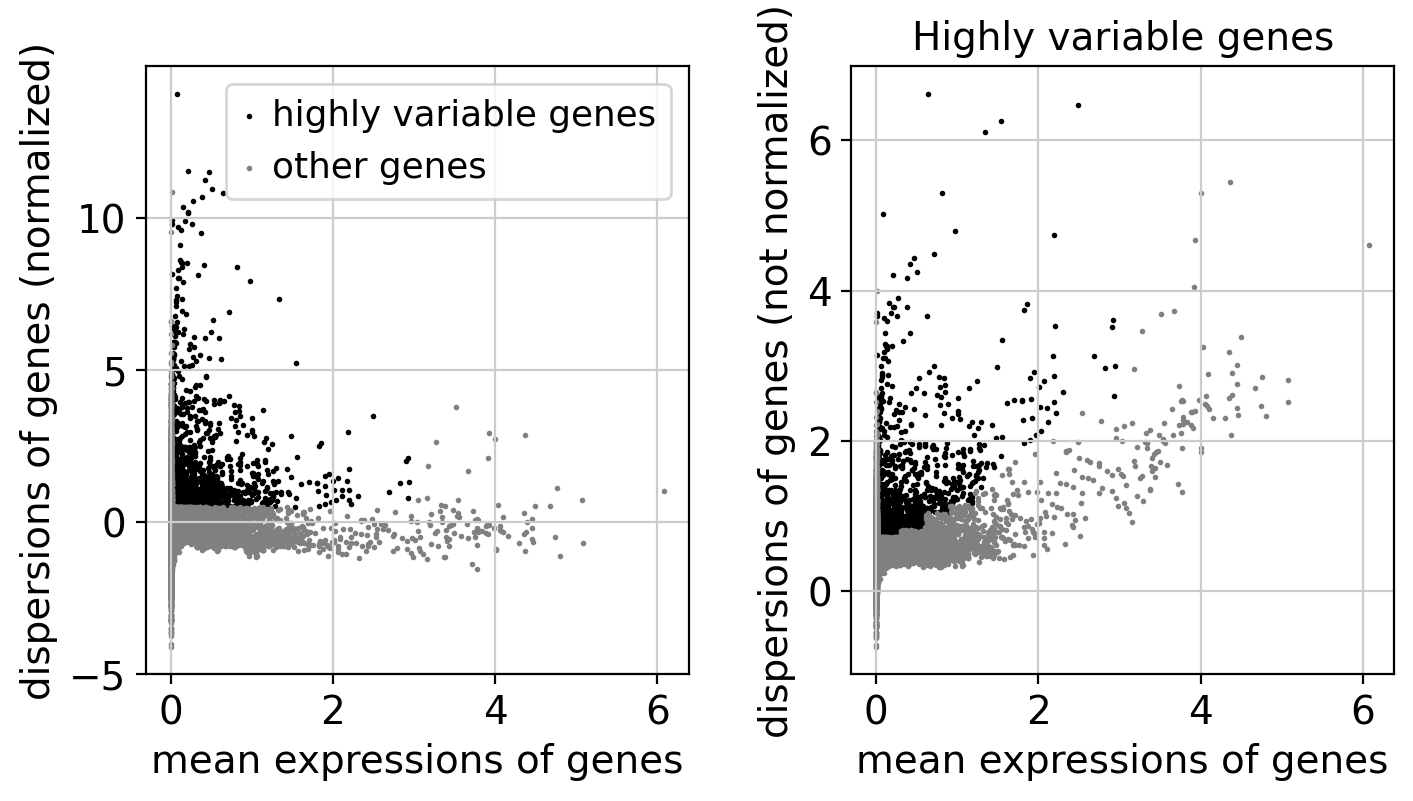
Highly variable genes (HVGs) are those that show significantly more variability across cells than expected due to technical noise. Identifying HVGs is a key step in single-cell RNA-seq analysis, as these genes are most informative for distinguishing between different cell states and types.
-
Left panel (Normalized dispersions):
- Each dot represents a gene.
- X-axis: Mean expression of the gene across all cells.
- Y-axis: Normalized dispersion (variance normalized by mean).
- Black dots: Genes selected as highly variable.
- Gray dots: Other genes.
- HVGs tend to lie above the cloud of other genes.
-
Right panel (raw dispersions):
- Shows raw (non-normalized) dispersions.
- Helps visualize the inherent variability before normalization.
Purpose of HVG selection:
- Reduces noise by filtering out uninformative genes.
- Focuses dimensionality reduction and clustering on genes that drive biological heterogeneity.
Dimensionality reduction
# Perform PCA on highly variable genes only
sc.tl.pca(adata, svd_solver='arpack', n_comps=50)

# Create PCA plots manually
fig, axes = plt.subplots(2, 2, figsize=(14, 10))

# Plot 1: PCA variance ratio
variance_ratio = adata.uns['pca']['variance_ratio']
axes[0,0].plot(range(1, len(variance_ratio)+1), variance_ratio, 'bo-', markersize=3)
axes[0,0].set_xlabel('Principal component')
axes[0,0].set_ylabel('Variance ratio')
axes[0,0].set_title('PCA variance ratio')
axes[0,0].set_yscale('log')

# Plot 2-4: PCA scatter plots
pca_coords = adata.obsm['X_pca']

# Color by total counts
scatter1 = axes[0,1].scatter(pca_coords[:, 0], pca_coords[:, 1],
                            c=adata.obs['total_counts'], s=1, alpha=0.7, cmap='viridis')
axes[0,1].set_xlabel('PC1')
axes[0,1].set_ylabel('PC2')
axes[0,1].set_title('PCA - Total counts')
plt.colorbar(scatter1, ax=axes[0,1])

# Color by number of genes
scatter2 = axes[1,0].scatter(pca_coords[:, 0], pca_coords[:, 1],
                            c=adata.obs['n_genes_by_counts'], s=1, alpha=0.7, cmap='viridis')
axes[1,0].set_xlabel('PC1')
axes[1,0].set_ylabel('PC2')
axes[1,0].set_title('PCA - Number of genes')
plt.colorbar(scatter2, ax=axes[1,0])

# Color by mitochondrial percentage
scatter3 = axes[1,1].scatter(pca_coords[:, 0], pca_coords[:, 1],
                            c=adata.obs['pct_counts_mt'], s=1, alpha=0.7, cmap='viridis')
axes[1,1].set_xlabel('PC1')
axes[1,1].set_ylabel('PC2')
axes[1,1].set_title('PCA - Mitochondrial %')
plt.colorbar(scatter3, ax=axes[1,1])

plt.tight_layout()

# Print PCA statistics
print(f"PCA completed:")
print(f"  Number of principal components: {adata.obsm['X_pca'].shape[1]}")
print(f"  Variance explained by first PC: {adata.uns['pca']['variance_ratio'][0]:.3f}")
print(f"  Variance explained by first 10 PCs: {adata.uns['pca']['variance_ratio'][:10].sum():.3f}")
print(f"  Variance explained by first 50 PCs: {adata.uns['pca']['variance_ratio'][:50].sum():.3f}")

# Show top contributing genes for first few PCs
n_top_genes = 5
for pc in range(3):  # First 3 PCs
    pc_loadings = adata.varm['PCs'][:, pc]
    top_genes_idx = np.argsort(np.abs(pc_loadings))[-n_top_genes:]
    top_genes = adata.var_names[top_genes_idx]
    loadings_values = pc_loadings[top_genes_idx]
    print(f"\nTop {n_top_genes} genes for PC{pc+1}:")
    for gene, loading in zip(top_genes, loadings_values):
        print(f"  {gene}: {loading:.3f}")

# Visualizes cells in PCA space, colored by the expression level of the gene CST3 for example
#sc.pl.pca(adata, color='CST3', vmin=0, vmax=10)
computing PCA
with n_comps=50
finished (0:00:02)
PCA completed:
Number of principal components: 50
Variance explained by first PC: 0.067
Variance explained by first 10 PCs: 0.191
Variance explained by first 50 PCs: 0.244
Top 5 genes for PC1:
FGL2: 0.082
CTSS: 0.083
CST3: 0.085
MNDA: 0.085
FCN1: 0.086
Top 5 genes for PC2:
IGHD: 0.100
BANK1: 0.102
IGHM: 0.106
MS4A1: 0.107
CD79A: 0.111
Top 5 genes for PC3:
PPBP: 0.112
GNG11: 0.113
PF4: 0.114
CAVIN2: 0.114
TUBB1: 0.115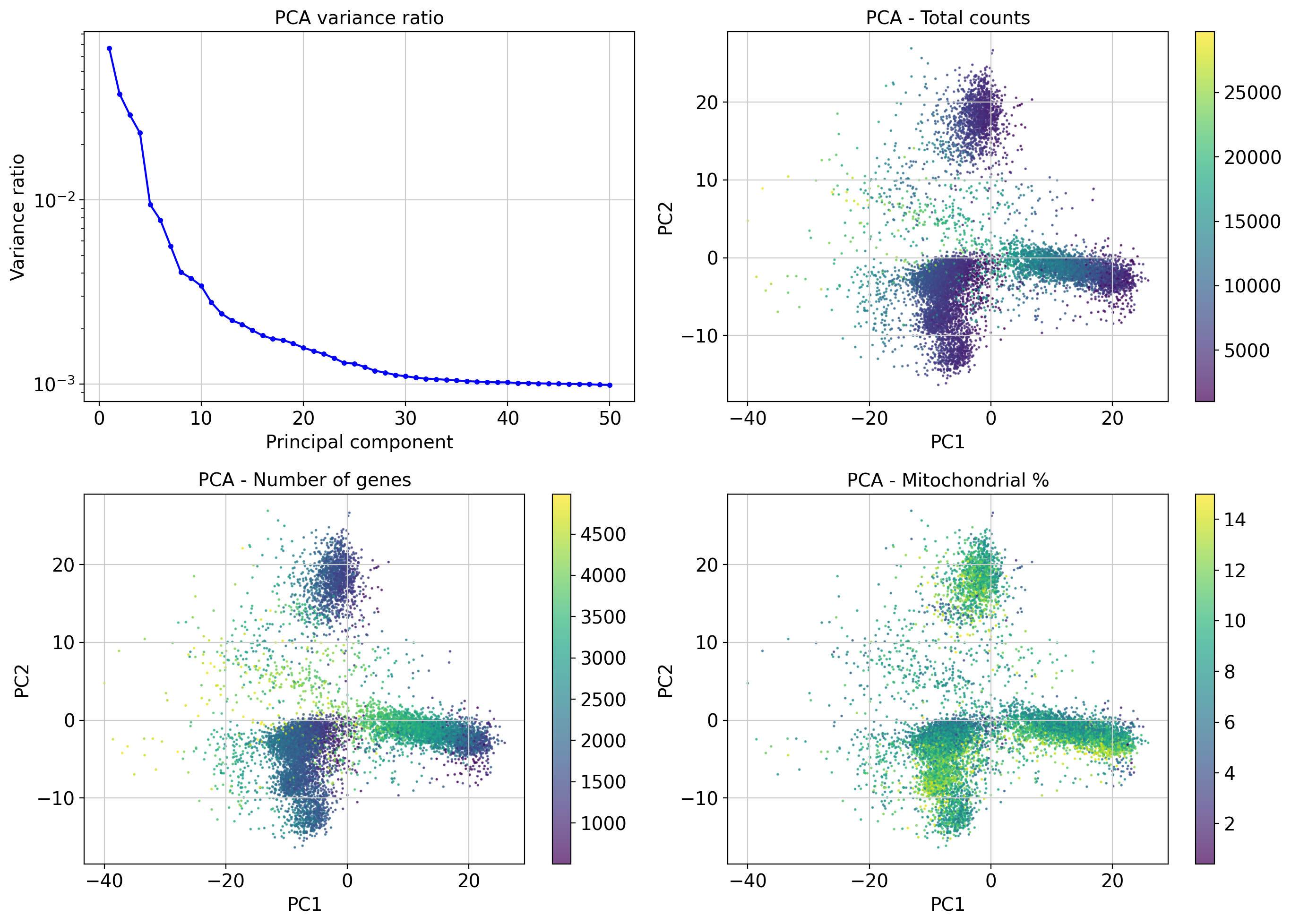
PCA reduces dimensionality while preserving variance structure in gene expression.
Variance ratio plot helps decide how many PCs to keep for downstream analyses (neighborhood graph). The steep drop suggests the first ~10–20 PCs capture most biological variance.
Color overlays (UMI, gene count, mito%) help diagnose technical biases:
- Cells with high UMI counts or gene counts form distinguishable dense regions.
- Mitochondrial gene percentage shows a distinct distribution, possibly marking stressed or dying cells.
Top gene loadings explain the biological meaning of the PCs, useful for exploratory interpretation.
Clustering
After computing the PCA, we construct a k-nearest neighbors graph using the top 40 PCs. This graph forms the basis for clustering cells into distinct groups based on transcriptomic similarity.
We apply the Leiden algorithm at multiple resolutions to explore the effect of clustering granularity. A smaller resolution yields fewer, broader clusters; higher resolution produces more refined ones. We also run Louvain clustering for comparison.
We select leiden_0.15 as our default resolution for downstream annotation.
# Compute the neighborhood graph
sc.pp.neighbors(adata, n_neighbors=10, n_pcs=40)
# Compute UMAP
sc.tl.umap(adata, random_state=42)

# Run Leiden and Louvain clustering with igraph backend
sc.tl.leiden(
    adata,
    resolution=0.15,
    random_state=42,
    flavor="igraph",     # Use igraph instead of leidenalg
    directed=False,       # Required for igraph backend
    n_iterations=2,      # Matches upcoming default
    key_added='leiden_0.15'
)

# Run with different reolutions
sc.tl.leiden(adata, resolution=0.5, key_added='leiden_0.5')
sc.tl.leiden(adata, resolution=0.8, key_added='leiden_0.8')
sc.tl.leiden(adata, resolution=1.0, key_added='leiden_1.0')

sc.tl.louvain(
    adata,
    flavor="igraph",
    directed=False,
    random_state=42
)

for resolution in ['leiden_0.15', 'leiden_0.5', 'leiden_0.8', 'leiden_1.0']:
    n_clusters = len(adata.obs[resolution].unique())
    print(f"  {resolution}: {n_clusters} clusters")

# Set default clustering
adata.obs['clusters'] = adata.obs['leiden_0.15']

# Check cluster sizes
print(adata.obs['leiden_0.15'].value_counts().sort_index())
print(adata.obs['louvain'].value_counts().sort_index())
computing neighbors
using 'X_pca' with n_pcs = 40finished: added to `.uns['neighbors']`
`.obsp['distances']`, distances for each pair of neighbors
`.obsp['connectivities']`, weighted adjacency matrix (0:00:22)
computing UMAP
finished: added
'X_umap', UMAP coordinates (adata.obsm)
'umap', UMAP parameters (adata.uns) (0:00:05)
running Leiden clustering
finished: found 10 clusters and added
'leiden_0.15', the cluster labels (adata.obs, categorical) (0:00:00)
running Leiden clusteringfinished: found 19 clusters and added
'leiden_0.5', the cluster labels (adata.obs, categorical) (0:00:00)
running Leiden clustering
finished: found 22 clusters and added
'leiden_0.8', the cluster labels (adata.obs, categorical) (0:00:00)
running Leiden clustering
finished: found 24 clusters and added
'leiden_1.0', the cluster labels (adata.obs, categorical) (0:00:00)
running Louvain clustering
finished: found 20 clusters and added
'louvain', the cluster labels (adata.obs, categorical) (0:00:00)
leiden_0.15: 10 clusters
leiden_0.5: 19 clusters
leiden_0.8: 22 clusters
leiden_1.0: 24 clusters
leiden_0.15
0 3122
1 953
2 240
3 3242
4 349
5 609
6 1392
7 341
8 60
9 200
Name: count, dtype: int64
louvain
0 1226
1 392
2 602
3 568
4 912
5 1485
6 529
7 952
8 342
9 83
10 547
11 353
12 110
13 1257
14 481
15 139
16 159
17 174
18 26
19 171
Name: count, dtype: int64UMAP
# Create UMAP plots
fig, axes = plt.subplots(2, 3, figsize=(18, 12))
fig.suptitle('UMAP visualization', fontsize=16)

# Plot 1: UMAP colored by clusters
umap_coords = adata.obsm['X_umap']
clusters = adata.obs['clusters'].astype(str)
unique_clusters = sorted(clusters.unique(), key=lambda x: int(x))

# Create a color map for clusters
colors = plt.cm.tab20(np.linspace(0, 1, len(unique_clusters)))
cluster_colors = {cluster: colors[i] for i, cluster in enumerate(unique_clusters)}

for cluster in unique_clusters:
    mask = clusters == cluster
    axes[0,0].scatter(umap_coords[mask, 0], umap_coords[mask, 1],
                     c=[cluster_colors[cluster]], label=f'Cluster {cluster}', s=1, alpha=0.7)
axes[0,0].set_xlabel('UMAP1')
axes[0,0].set_ylabel('UMAP2')
axes[0,0].set_title('Clusters (Leiden 0.15)')
axes[0,0].legend(bbox_to_anchor=(1.05, 1), loc='upper left', markerscale=5)

# Plot 2: UMAP colored by total counts
scatter1 = axes[0,1].scatter(umap_coords[:, 0], umap_coords[:, 1],
                            c=adata.obs['total_counts'], s=1, alpha=0.7, cmap='viridis')
axes[0,1].set_xlabel('UMAP1')
axes[0,1].set_ylabel('UMAP2')
axes[0,1].set_title('Total counts')
plt.colorbar(scatter1, ax=axes[0,1])

# Plot 3: UMAP colored by number of genes
scatter2 = axes[0,2].scatter(umap_coords[:, 0], umap_coords[:, 1],
                            c=adata.obs['n_genes_by_counts'], s=1, alpha=0.7, cmap='viridis')
axes[0,2].set_xlabel('UMAP1')
axes[0,2].set_ylabel('UMAP2')
axes[0,2].set_title('Number of genes')
plt.colorbar(scatter2, ax=axes[0,2])

# Plot 4: UMAP colored by mitochondrial percentage
scatter3 = axes[1,0].scatter(umap_coords[:, 0], umap_coords[:, 1],
                            c=adata.obs['pct_counts_mt'], s=1, alpha=0.7, cmap='viridis')
axes[1,0].set_xlabel('UMAP1')
axes[1,0].set_ylabel('UMAP2')
axes[1,0].set_title('Mitochondrial %')
plt.colorbar(scatter3, ax=axes[1,0])

# Plot 5: UMAP colored by ribosomal percentage
scatter4 = axes[1,1].scatter(umap_coords[:, 0], umap_coords[:, 1],
                            c=adata.obs['pct_counts_ribo'], s=1, alpha=0.7, cmap='viridis')
axes[1,1].set_xlabel('UMAP1')
axes[1,1].set_ylabel('UMAP2')
axes[1,1].set_title('Ribosomal %')
plt.colorbar(scatter4, ax=axes[1,1])

# Plot 6: Different clustering resolution
clusters_05 = adata.obs['leiden_0.5'].astype(str)
unique_clusters_05 = sorted(clusters_05.unique(), key=lambda x: int(x))
colors_05 = plt.cm.tab20(np.linspace(0, 1, len(unique_clusters_05)))
cluster_colors_05 = {cluster: colors_05[i] for i, cluster in enumerate(unique_clusters_05)}

for cluster in unique_clusters_05:
    mask = clusters_05 == cluster
    axes[1,2].scatter(umap_coords[mask, 0], umap_coords[mask, 1],
                     c=[cluster_colors_05[cluster]], s=1, alpha=0.7)
axes[1,2].set_xlabel('UMAP1')
axes[1,2].set_ylabel('UMAP2')
axes[1,2].set_title('Clusters (Leiden 0.5)')

plt.tight_layout()
print(f"UMAP coordinates shape: {adata.obsm['X_umap'].shape}")
UMAP coordinates shape: (10508, 2)
We visualize cells in 2D UMAP space to assess both clustering and quality control signals.
- Top left: Clusters from Leiden at resolution 0.15 (used as default for annotation).
- Top middle/right: Total UMI counts and number of detected genes per cell.
- Bottom left: Mitochondrial content; high values may indicate stressed or dying cells.
- Bottom middle: Ribosomal gene percentage; useful for assessing translational activity.
- Bottom right: Clusters at higher Leiden resolution (0.5), showing finer structure.
These views help identify overclustering, technical artifacts or batch effects before annotation.
sc.pl.umap(adata, color=['leiden_0.15', 'louvain'], legend_loc='on data')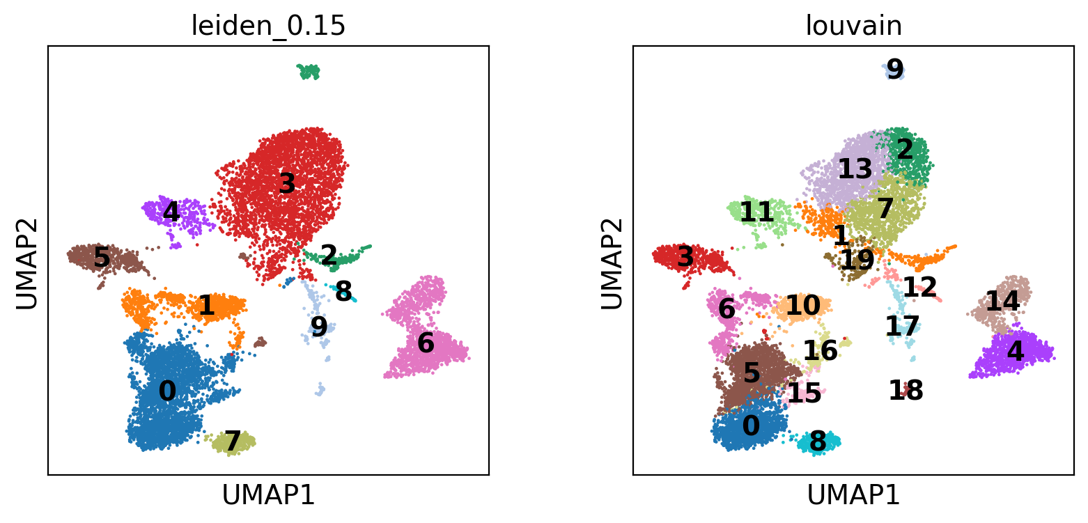
We compare Leiden and Louvain clustering on the same UMAP projection.
- Leiden (resolution 0.15): Often preferred for its ability to detect well-connected communities. Yields 10 broader clusters, reflecting major cell populations.
- Louvain: Tends to over-partition, especially in noisy data. Identifies 20 finer subpopulations, some potentially oversegmented.
Overlaying both allows a quick visual assessment of cluster granularity and consistency across methods.
Differential expression
- We use
sc.tl.rank_genes_groups()with the Wilcoxon test to find genes differentially expressed across clusters. - The top 5 markers per cluster are visualized.
- These markers help guide manual cell type annotation based on known immune gene signatures.
Identify marker genes
# Find marker genes for each cluster
sc.tl.rank_genes_groups(
    adata,
    groupby='leiden_0.15',
    method='wilcoxon',
    key_added='rank_genes_groups',
    pts=True
)

sc.pl.rank_genes_groups(adata, n_genes=5, sharey=False) # n_genes=20

# Optional: save results to DataFrame
#marker_df = sc.get.rank_genes_groups_df(adata, group='0')  # change group as needed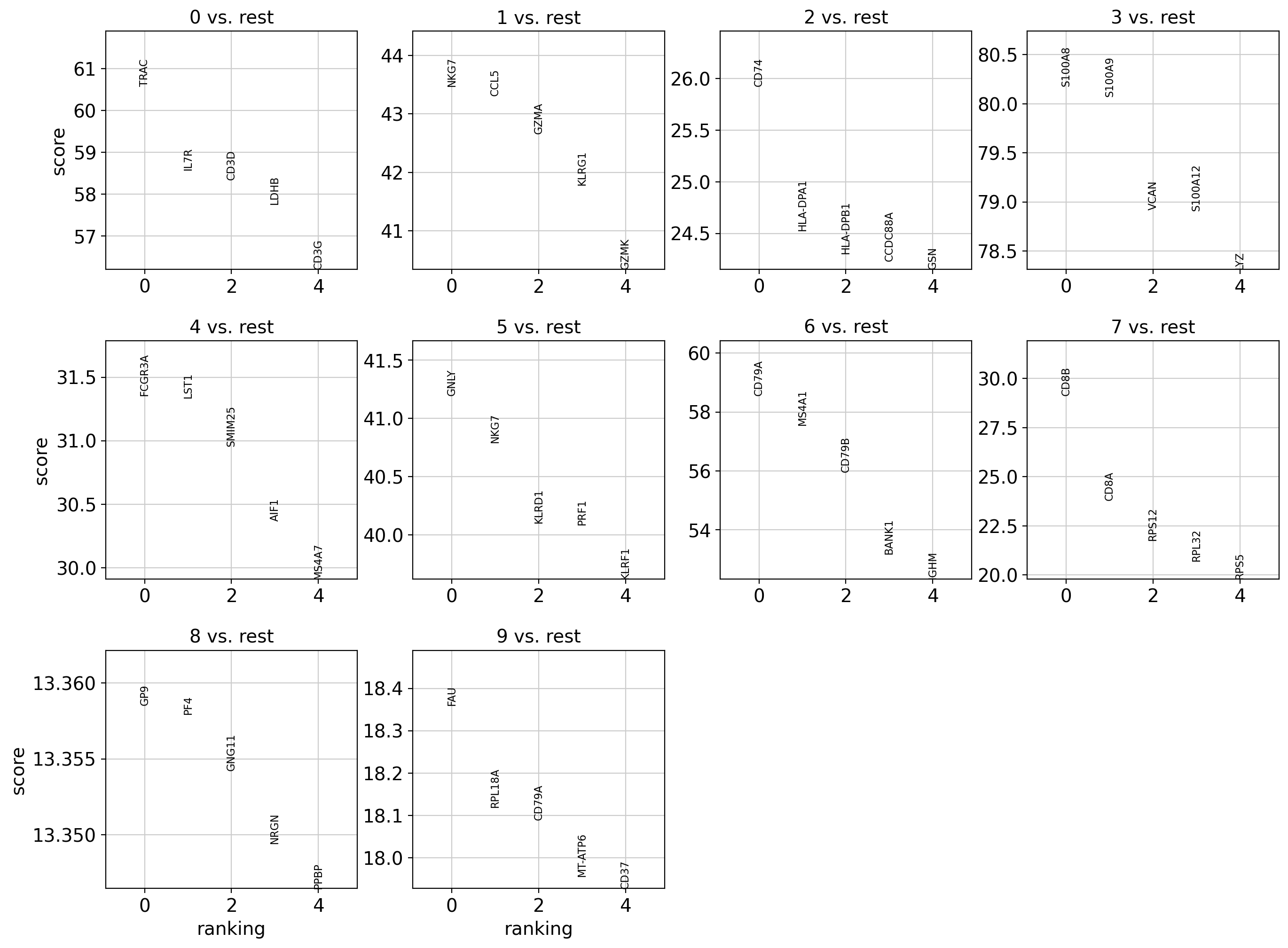
This plot shows the top 5 differentially expressed genes (DEGs) for each cluster (Leiden 0.15), computed using the Wilcoxon test.
- Each subplot compares one cluster to all others.
- Marker genes can be used to infer cell types based on known expression profiles.
- For example:
- Cluster 0: TRAC, IL7R → likely CD4+ T cells
- Cluster 1: NKG7, GZMA → likely NK or cytotoxic T/NK cells
Visualize and export marker genes
# Access result from AnnData object
result = adata.uns['rank_genes_groups']
groups = result['names'].dtype.names

# Build dataframe
marker_df = pd.DataFrame({
    f"{group}_{key}": result[key][group]
    for group in groups for key in ['names', 'pvals_adj', 'logfoldchanges']
})

# Show top genes
print(marker_df.head(10))

# Save to CSV
marker_df.to_csv("marker_genes_per_cluster.csv")

# Top 5 marker genes per cluster
sc.pl.rank_genes_groups_stacked_violin(
    adata,
    n_genes=5,
    groupby='leiden_0.15',
    use_raw=True,
    show=True
)
0_names 0_pvals_adj 0_logfoldchanges 1_names 1_pvals_adj \
0 TRAC 0.0 6.650535 NKG7 0.000000e+00
1 IL7R 0.0 8.712159 CCL5 0.000000e+00
2 CD3D 0.0 4.957501 GZMA 0.000000e+00
3 LDHB 0.0 6.251576 KLRG1 0.000000e+00
4 CD3G 0.0 4.193146 GZMK 0.000000e+00
5 CD3E 0.0 4.280351 CST7 0.000000e+00
6 TCF7 0.0 4.000473 CTSW 0.000000e+00
7 RPS29 0.0 28.898661 IL32 0.000000e+00
8 RPS27 0.0 53.097359 TRGC2 1.563784e-273
9 LTB 0.0 8.916184 KLRB1 6.632533e-256
1_logfoldchanges 2_names 2_pvals_adj 2_logfoldchanges 3_names ... \
0 11.871605 CD74 1.106110e-143 191.140198 S100A8 ...
1 12.121916 HLA-DPA1 1.364733e-128 137.927307 S100A9 ...
2 7.822484 HLA-DPB1 1.963155e-126 107.251457 VCAN ...
3 5.498188 CCDC88A 8.637142e-126 9.113780 S100A12 ...
4 8.620037 GSN 4.869852e-125 7.728571 LYZ ...
5 5.087254 HLA-DRA 6.188354e-125 225.423019 MNDA ...
6 4.747373 GNAS 2.665227e-124 15.931124 FOS ...
7 10.447199 HLA-DRB1 1.099161e-123 95.571693 FCN1 ...
8 6.036745 RPLP0 2.443697e-122 31.795084 CD14 ...
9 15.234795 RPS11 8.985897e-121 49.612915 DUSP1 ...
6_logfoldchanges 7_names 7_pvals_adj 7_logfoldchanges 8_names \
0 13.351170 CD8B 6.326865e-182 7.974900 GP9
1 11.415776 CD8A 7.407538e-121 4.671919 PF4
2 9.078203 RPS12 4.725846e-101 60.438091 GNG11
3 7.535903 RPL32 1.509409e-91 36.121338 NRGN
4 27.649193 RPS5 1.394454e-83 14.555116 PPBP
5 11.922980 RPS6 1.914490e-82 29.472307 CAVIN2
6 7.066478 TCF7 9.436159e-82 3.161120 TUBB1
7 5.083807 RPS3A 2.507023e-81 32.821030 ODC1
8 9.658760 RPS3 5.444711e-79 25.497389 SPARC
9 6.419218 RPS21 5.492118e-79 17.358566 TUBA4A
8_pvals_adj 8_logfoldchanges 9_names 9_pvals_adj 9_logfoldchanges
0 7.250936e-37 20.623075 FAU 9.207220e-71 25.899172
1 7.250936e-37 73.324547 RPL18A 3.750465e-69 55.297630
2 7.250936e-37 32.883549 CD79A 4.297851e-69 10.636338
3 7.250936e-37 60.786201 MT-ATP6 3.591316e-68 103.532097
4 7.250936e-37 154.947052 CD37 4.829097e-68 12.125234
5 7.250936e-37 34.930321 RPS23 7.304824e-68 61.317238
6 7.563168e-37 29.227810 PTMA 7.304824e-68 29.273266
7 8.344185e-37 19.230534 RPL41 1.044715e-67 85.344757
8 1.048488e-36 11.514441 MS4A1 1.384798e-66 9.048560
9 1.844881e-36 18.180162 MT-ND4 1.135585e-65 74.609802
[10 rows x 30 columns]
WARNING: dendrogram data not found (using key=dendrogram_leiden_0.15). Running `sc.tl.dendrogram` with default parameters. For fine tuning it is recommended to run `sc.tl.dendrogram` independently.
using 'X_pca' with n_pcs = 50
Storing dendrogram info using `.uns['dendrogram_leiden_0.15']`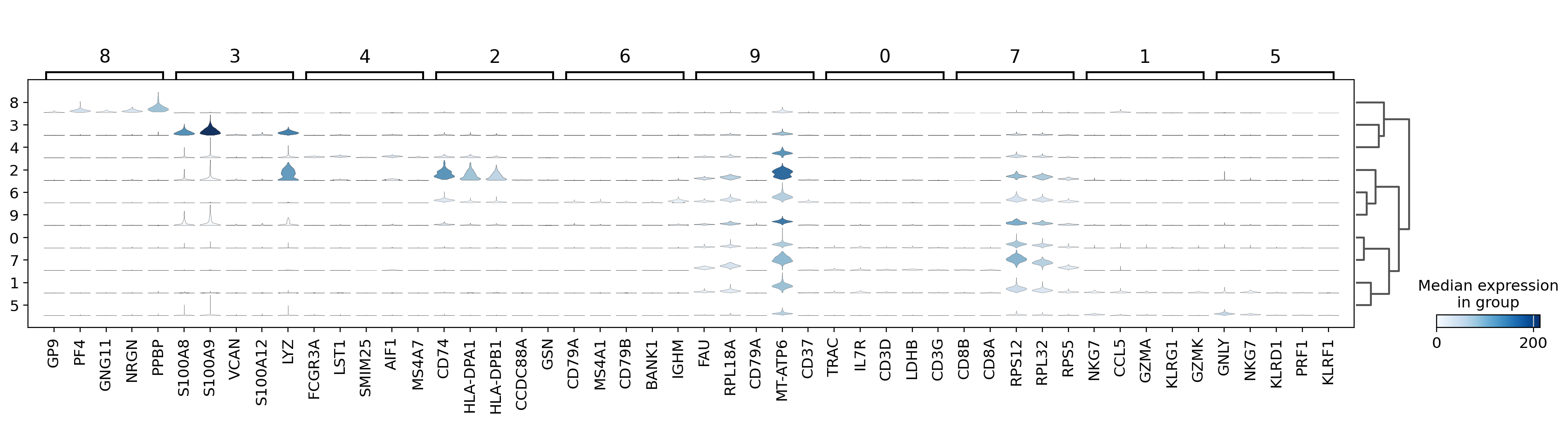
The stacked violin plot shows the expression of the top 5 marker genes for each cluster, identified using the Wilcoxon test.
- Each row corresponds to a cluster (Leiden 0.15).
- The width of the violins reflects the gene expression distribution across cells in each cluster.
- This visualization helps confirm cluster identity by highlighting known cell-type-specific genes.
Cell type annotation
Define marker gene signatures & visualize markers
# Define PBMC marker genes
pbmc_markers = {
    'CD4+ T cells': ['CD4', 'IL7R', 'CCR7'],
    'CD8+ T cells': ['CD8A', 'CD8B', 'GZMK'],
    'Cytotoxic T/NK Cells': ['GZMA', 'GZMB', 'NKG7', 'KLRB1'],
    'NK cells': ['GNLY', 'NKG7', 'FGFBP2'],
    'B cells': ['MS4A1', 'CD79A', 'CD79B'],
    'CD14+ Monocytes': ['CD14', 'LYZ', 'CD68'],
    'FCGR3A+ Monocytes': ['FCGR3A', 'MS4A7'],
    'Dendritic Cells': ['FCER1A', 'CST3'],
    'Megakaryocytes': ['PPBP', 'PF4'],
    'Progenitor-like': ['SOX4', 'HMGB1', 'RPL15']  # These are approximate, often dataset-specific
}


# Visualize expression to validate
sc.pl.dotplot(adata, var_names=pbmc_markers, groupby='leiden_0.15', use_raw=True)
sc.pl.matrixplot(adata,
    var_names=pbmc_markers,
    groupby='leiden_0.15',
    use_raw=True,
    standard_scale='var',  # Normalize gene expression across all clusters
    cmap='Reds'
)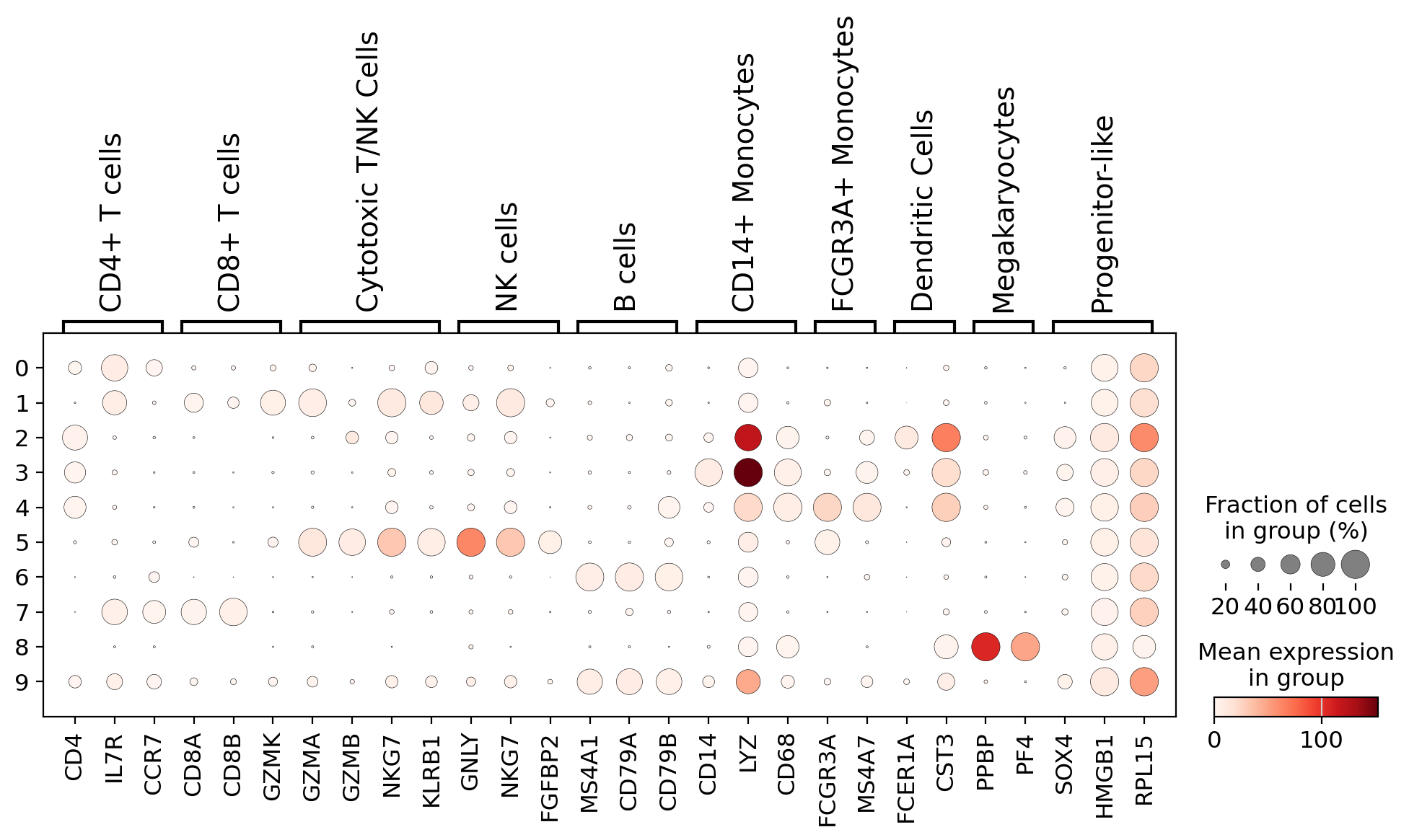
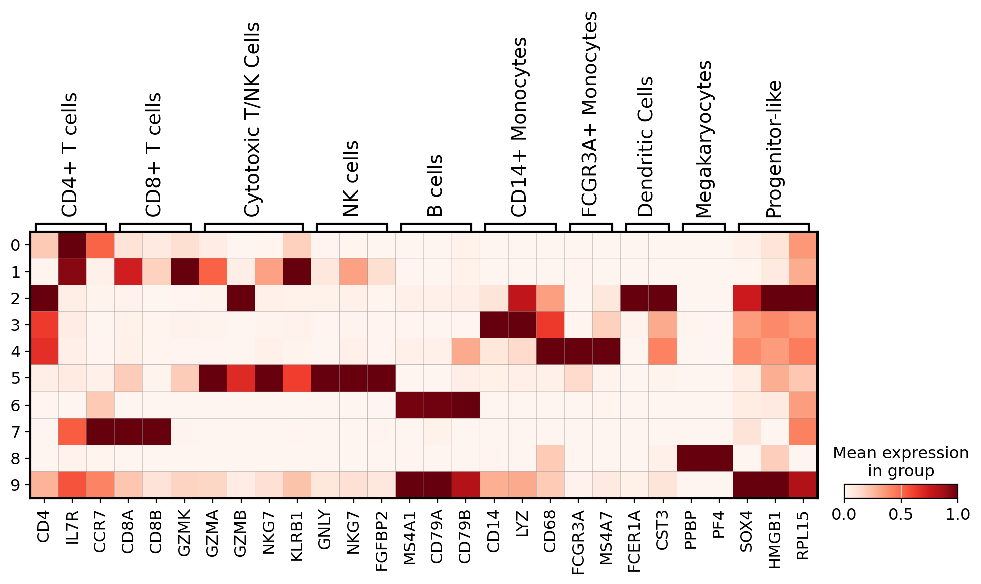
To interpret cell clusters, we visualized the expression of well-established PBMC marker genes across clusters:
- Dotplot: Displays the average expression (color intensity) and fraction of expressing cells (dot size) for each gene-cluster pair.
- Matrixplot: Shows normalized expression levels, helping in the identification of clusters by their transcriptional signatures.
These plots support manual annotation by aligning cluster-specific expression profiles with known marker combinations, like CD14 + LYZ for monocytes or GNLY + NKG7 for NK cells.
Assign cell types to clusters
# Map clusters to cell types
cluster_annotation = {
    '0': 'CD4+ T cells',
    '1': 'Cytotoxic T/NK Cells',
    '2': 'Dendritic Cells',
    '3': 'Monocytes',
    '4': 'FCGR3A+ Monocytes',
    '5': 'NK Cells',
    '6': 'B Cells',
    '7': 'CD8+ T cells',
    '8': 'Megakaryocytes',
    '9': 'Progenitor-like',
}

adata.obs['cell_type'] = adata.obs['leiden_0.15'].map(cluster_annotation)

# Plot annotated UMAP
sc.pl.umap(adata, color='cell_type', legend_loc='on data',
           legend_fontsize=10, legend_fontoutline=2, frameon=False)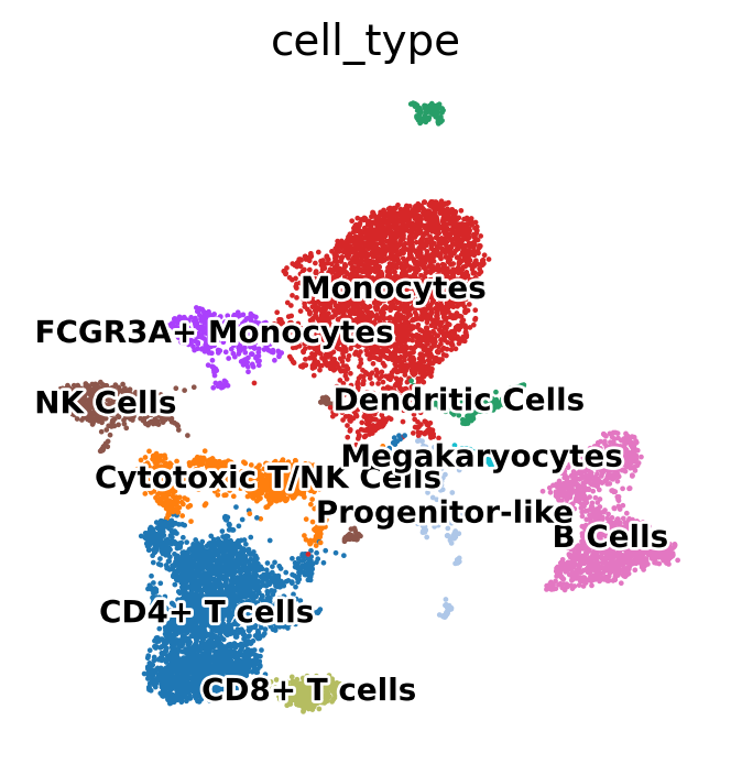
Using known marker genes and expression patterns, we mapped Leiden clusters to specific PBMC cell types. The annotated UMAP plot below displays the resulting assignments, enabling biological interpretation of clusters:
- T cells (CD4+, CD8+)
- NK cells
- B cells
- Monocytes (CD14+ and FCGR3A+)
- Dendritic cells
- Megakaryocytes
- Progenitor-like cells
This annotation provides the basis for downstream differential expression and functional analyses.
Validate annotation
sc.pl.umap(
    adata,
    color=['LYZ', 'RPL15', 'PPBP'],
    use_raw=True,
    vmin=0,
    vmax=100,
    cmap='Reds',
    size=20
)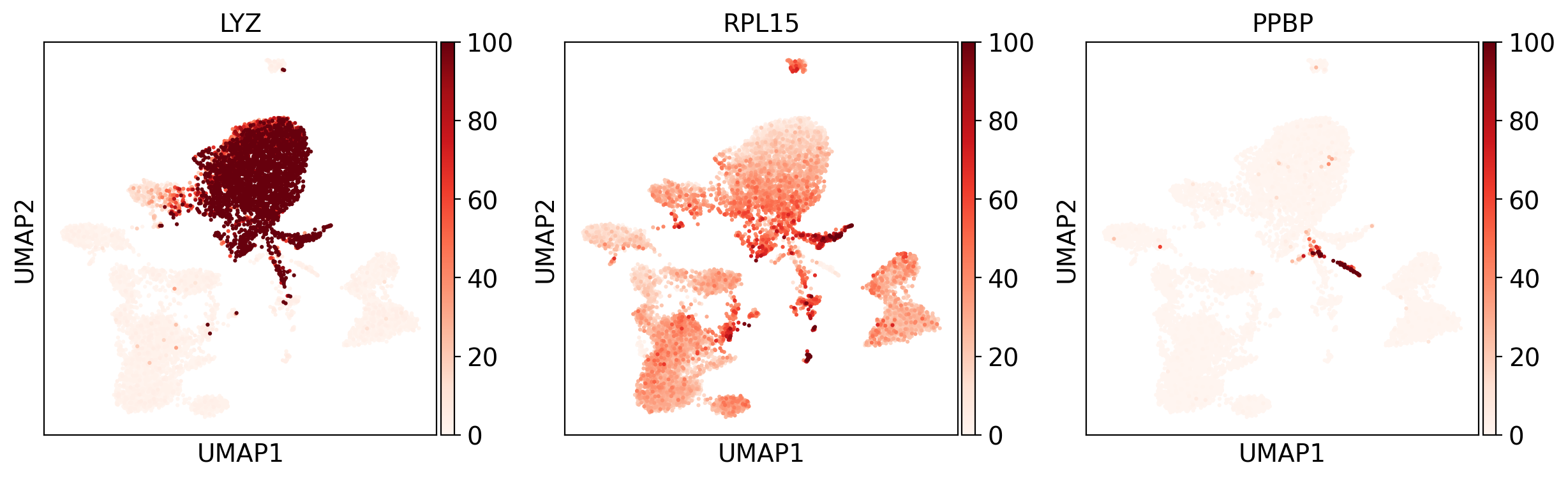
We visualized canonical marker genes across the UMAP to validate cluster-specific expression:
- LYZ: Monocyte marker, clearly enriched in the right cluster.
- RPL15: Ribosomal gene, broadly expressed across cell types, more particularly in progenitor-like cells.
- PPBP: Megakaryocyte-specific marker, confirming cluster identity.
These gene-level projections provide further confidence in the manual cell type annotations.
Trajectory analysis
# PAGA analysis for cluster relationships
sc.tl.paga(adata, groups='leiden_0.15')
sc.pl.paga(adata)
sc.tl.umap(adata, init_pos='paga', random_state=42)
running PAGA
finished: added
'paga/connectivities', connectivities adjacency (adata.uns)
'paga/connectivities_tree', connectivities subtree (adata.uns) (0:00:00)
--> added 'pos', the PAGA positions (adata.uns['paga'])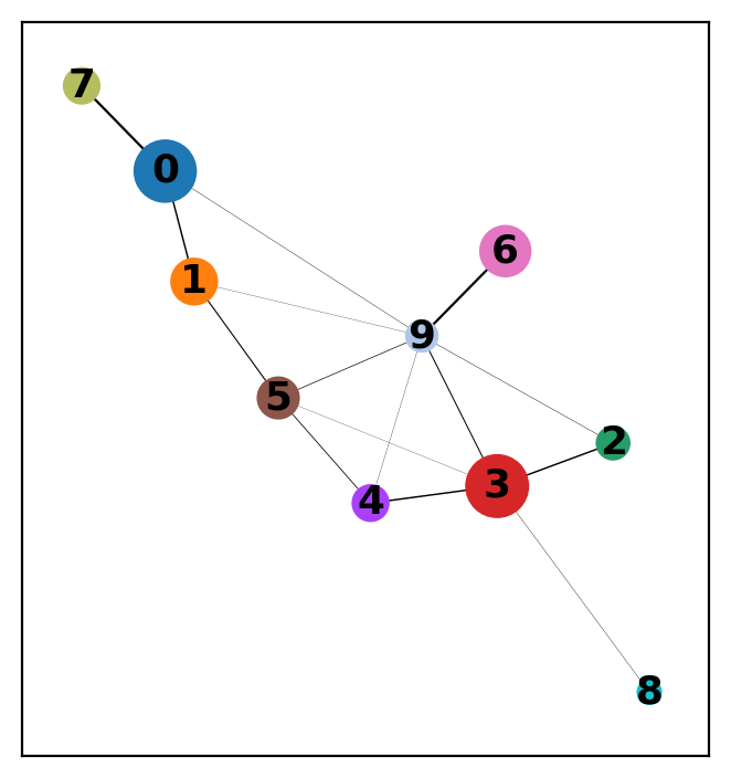
computing UMAP
    finished: added
    'X_umap', UMAP coordinates (adata.obsm)
    'umap', UMAP parameters (adata.uns) (0:00:03)
We applied PAGA to summarize the connectivity between clusters identified by Leiden clustering (resolution=0.15). Each node represents a cluster, and edge thickness reflects the statistical connectivity between clusters based on shared nearest neighbors.
Key insights:
- Strong connectivity between clusters 0, 1 and 7 suggests a T/NK cell lineage continuum.
- Cluster 3 (Monocytes) connects moderately with several other clusters, consistent with its immune signaling interactions.
- Cluster 9 (Progenitor-like) is central, bridging distant lineages, possibly due to low specificity or transitional expression.
We then re-initialized UMAP using init_pos='paga' to reflect this global topology in the final embedding.
Data export
# Save full AnnData object
!mkdir -p results
adata.write('results/processed_pbmc_data.h5ad', compression='gzip')  # Recommended compressed format
Conclusion
Through this analysis, we successfully identified and annotated key immune cell types, including:
- CD4+ and CD8+ T cells
- NK cells
- B cells
- Classical and non-classical monocytes
- Dendritic cells
- Megakaryocytes
Using Leiden clustering and marker gene expression, we confirmed the identity of each cluster. Visualizations such as UMAP, violin plots and dotplots helped validate both the computational steps and biological interpretations.
This workflow can be extended to other scRNA-seq datasets and modified to include batch correction or integration with reference atlases.