Preprocessing scRNA-seq data with Seurat
Author: Hugo Chenel
Purpose: This advanced tutorial guides researchers through preprocessing single-cell RNA-seq (scRNA-seq) data using Seurat, a powerful R package for single-cell analysis. Topics include quality control, normalization, clustering and cell type annotation.
Introduction
In this tutorial we will process and analyze the pbmc3k dataset, a well‐characterized human PBMC dataset from 10× Genomics. Our objectives are to:
- automatically download and import the dataset
- perform quality control and visualize key metrics (knee plot, violin plots, scatter plots)
- filter out low-quality cells and remove potential doublets
- normalize the data, select highly variable features and reduce dimensionality
- cluster the cells and annotate cell types based on known markers
- conduct differential expression analysis
Objectives : You will learn how to clean single cells data, extract high quality cells and identify sub-populations of cells.
We will be using the R packages Seurat (https://satijalab.org/seurat/).
Data
Study description
We will analyze data generated from the study: “p53 drives a transcriptional program that elicits a non-cell-autonomous response and alters cell state in vivo” by S.M. Moyer et al., published in PNAS in 2020 (https://doi.org/10.1073/pnas.2008474117).
The single-cell RNA sequencing samples were prepared using the Chromium platform from 10X Genomics. Read quality control was performed and no major abnormalities were detected. Sequencing reads were aligned to the reference genome using CellRanger (version 6.0.2).
To ensure reproducibility, we automatically download the pbmc3k dataset.
Download data
# Create a directory to store the data if it doesn't exist
if (!dir.exists("data")) {
  dir.create("data")
}

# Define download URL and file paths for the pbmc3k dataset
data_url <- "https://cf.10xgenomics.com/samples/cell/pbmc3k/pbmc3k_filtered_gene_bc_matrices.tar.gz"
data_tar <- "data/pbmc3k.tar.gz"
data_dir <- "data/filtered_gene_bc_matrices"

# Download and extract data if not already present
if (!dir.exists(data_dir)) {
  download.file(data_url, destfile = data_tar)
  untar(data_tar, exdir = "data")
}

sample.name <- "pbmc3k"
Import data and create Seurat object
The data are stored in the 10× Genomics format. Here we load the count matrix from the human genome (hg19) folder and create a Seurat object.
Single-cell RNA-seq data are presented in a matrix, where each row represents a gene and each column represents a single cell with a raw count (UMI). We first load the matrix then create a Seurat object, the data structure suitable to work with Seurat.
# Read the data from the "hg19" folder
sc_data <- Read10X(data.dir = file.path(data_dir, "hg19"))
# Check the class and dimensions of the data
print(class(sc_data))     # Expected: sparse matrix
print(dim(sc_data))       # Approximately 33,000 genes x 2,700–3,000 cells

# Create a Seurat object with minimal filtering:
# Retain cells with at least 200 detected genes and genes present in at least 3 cells.
sobj <- CreateSeuratObject(counts = sc_data,
                           min.cells = 3,
                           min.features = 200,
                           project = "pbmc3k")
sobj
A dgCMatrix is an efficient way to store an array with a lot of zeros in a computer (sparse matrix).
We have ~32,000 genes and ~2,700 barcodes (cells).
Setup
Set seed and load required packages
We begin by setting a random seed for reproducibility and loading the necessary libraries.
# Set a fixed seed for reproducibility
set.seed(42)

# Load required packages
suppressPackageStartupMessages({
  library(Seurat)
  library(dplyr)
  library(ggplot2)
  library(Matrix)
  library(SingleCellExperiment)
  library(scDblFinder)
})
Requirements check
# Check if Seurat v5 is installed
if (packageVersion("Seurat") < "5.0.0") {
  stop("❌ This workflow requires Seurat v5.0.0 or higher. Please update your Seurat package using BiocManager::install('Seurat').")
}
Quality control
PBMC data often contain droplets with ambient RNA or low-quality cells. We start by visualizing key QC metrics.
Knee plot
The knee plot displays the number of UMIs per droplet in descending order and helps distinguish true cells from empty droplets.
The first quality check (QC) is to look at the shape of the “knee plot”, which show you the number of UMI in droplets. In this plot, cells are ordered by the number of UMI counts associated to them (shown on the x-axis) and the fraction of droplets with at least that number of cells is shown on the y-axis.
This plot helps to:
- Differentiate true cells from empty droplets (containing only ambient RNA)
- Identify potential quality issues:
- Low number of detected barcodes → undersequencing
- Low maximum UMI per barcode → possible cell lysis issues The first quality control step is generating a knee plot, which helps visualize the distribution of UMI counts across droplets.
# Compute total UMI counts per barcode and rank them
nb_umi_by_barcode <- data.frame(nb_umi = Matrix::colSums(sc_data),
                                barcodes = colnames(sc_data)) %>%
  arrange(desc(nb_umi)) %>%
  mutate(barcode_rank = seq_along(nb_umi))

# Plot the knee plot (log-log scale)
ggplot(nb_umi_by_barcode, aes(x = barcode_rank, y = nb_umi)) +
  geom_point() +
  ggtitle("Knee plot of UMI Counts per droplet (pbmc3k)") +
  scale_x_log10() +
  xlab("Droplet rank (log scale)") +
  scale_y_log10() +
  ylab("Number of UMIs per droplet (log scale)") +
  theme_minimal()
Typically, you might use a threshold (around 1000 UMIs) as a guide, but this will be refined based on additional QC metrics.
Create Seurat object
To work with Seurat, we first need to create a Seurat object. This specialized object structure allows Seurat to store raw counts, metadata, dimensionality reductions and analysis results all in one place.
During creation, we can apply an initial basic filtering to exclude:
- Low-quality barcodes: barcodes with fewer than 200 detected genes (likely empty droplets, debris or dying cells).
- Lowly expressed genes: genes detected in fewer than 5 cells across the dataset.
# Create a Seurat object with minimal filtering
sobj <- CreateSeuratObject(
  counts = sc_data,          # The raw UMI count matrix
  min.cells = 5,             # Keep genes detected in ≥5 cells
  min.features = 200,        # Keep cells with ≥200 detected genes
  project = "pbmc3k"         # Project name
)

# Inspect the Seurat object
class(sobj)         # Seurat object class
head(colnames(sobj)) # Barcodes (cell identifiers)
head(rownames(sobj)) # Features (gene names)

ncol(sobj)          # Number of cells after filtering
nrow(sobj)          # Number of genes after filtering

# Display a summary of the Seurat object
sobj
Seurat may issue a warning regarding underscores in gene names, automatically replacing them with dashes to comply with internal naming conventions.
After filtering:
- The number of barcodes typically decreases dramatically, reflecting the removal of empty or low-quality droplets.
- The number of genes moderately decreases, as only rarely expressed genes are filtered out.
In the pbmc3k dataset, after filtering, approximately 2,700 barcodes and 12,500 genes are retained.
Working with Seurat object
In Seurat, data are organized hierarchically into different compartments, referred to as slots at the object level and layers within assays. Slots store general categories of data, while layers provide finer organization within each assay (RNA expression assays).
The main components are:
assays: Contains raw and normalized expression matrices and related data across one or multiple modalities (scRNA-seq, ATAC-seq).meta.data: Contains per-cell metadata such as total UMI counts and detected features.reductions: Stores results of dimensionality reduction techniques such as PCA, UMAP and clustering outputs.
Navigation within a Seurat object can be performed using:
- A sequence of access operators (
@,$). - Shortcut notations using double brackets (
[[ ]]). - Specialized accessor functions provided by Seurat.
Meta-data
Cell-associated metadata are stored in the meta.data slot. This includes default fields such as the total UMI count (nCount_RNA) and the number of detected genes (nFeature_RNA).
# Full path access to metadata
sobj@meta.data[1:10,]

# Shortcut access to metadata
sobj[[]][1:10,]

# Direct access to a specific metadata column
sobj$nCount_RNA[1:10]
The metadata structure includes:
orig.ident: Identifier for the dataset or sample.nCount_RNA: Total number of UMIs detected per cell.nFeature_RNA: Number of genes detected per cell.
Expression layers
Within the RNA assay, different layers store various stages of the expression data:
counts: The raw UMI count matrix (direct import).data: The normalized expression matrix (populated after normalization).scale.data: The scaled expression matrix, used for dimensionality reduction and clustering.var.features: A list of highly variable genes (identified during feature selection).
Initially, only the raw counts layer is populated. Other layers will be filled progressively during preprocessing and analysis steps.
Extraction of expression values can be performed as follows:
# Access raw counts using full path
sobj@assays$RNA@layers$counts[1:10, 1:4]

# Shortcut access to counts layer
sobj[["RNA"]]$counts[1:10, 1:4]

# Using the LayerData method
LayerData(sobj, assay = "RNA", layer = "counts")[1:10, 1:4]
# GetAssayData(sobj, assay = "RNA", layer = "counts")[1:10, 1:4]
The matrices are stored as sparse matrices (dgCMatrix class), which optimize memory usage for datasets where most entries are zero.
Basic pre-processing
scRNA-seq datasets require an initial preprocessing step to remove low-quality cells and normalize expression levels across cells. The two main objectives at this stage are:
- Filtering: Exclude low-quality cells, such as undersequenced cells, cellular debris and multiplets (doublets or higher-order cell aggregates).
- Normalization: Correct for sequencing depth biases by normalizing UMI counts across cells.
Remove low quality cells
Several metrics are commonly evaluated to identify and remove low-quality cells:
- Number of unique genes detected per cell:
- Cells with a very low number of detected genes are likely to correspond to empty droplets, debris or undersequenced cells.
- Cells with an abnormally high number of detected genes are often doublets or multiplets. The probability of multiplet formation increases with the number of cells loaded during library preparation.
- Total UMI counts per cell:
- The total number of UMIs correlates strongly with the number of detected genes.
- Examining the relationship between UMI counts and gene counts can help identify outliers with atypical profiles.
- Percentage of mitochondrial transcripts:
- Dying or stressed cells often exhibit high levels of mitochondrial RNA content.
- Cells with an elevated percentage of mitochondrial reads are typically excluded from downstream analyses.
Seurat provides built-in functionality to compute, visualize and filter cells based on these key QC metrics.
Exploring gene count distribution per cell
Evaluating the number of genes detected per cell provides essential information for QC in single-cell RNA-seq datasets. Cells with anomalously low or high numbers of detected genes may represent technical artifacts and should be carefully assessed.
Statistical summary of gene detection
A preliminary statistical summary of the number of genes detected per cell can be obtained as follows:
# Display a statistical summary of the number of detected genes per cell
summary(sobj$nFeature_RNA)
Visualization of gene count distribution
The distribution of gene counts across all cells can be visualized using a histogram:
# Prepare a data frame for plotting
df <- data.frame(nFeature_RNA = sobj$nFeature_RNA)

# Plot the distribution of gene counts per cell
ggplot(df, aes(x = nFeature_RNA)) +
  geom_histogram(bins = 50, fill = "skyblue", color = "white") +
  geom_vline(aes(xintercept = median(nFeature_RNA, na.rm = TRUE)),
             color = "red", linetype = "dashed", size = 1) +
  scale_x_continuous(limits = c(0, quantile(df$nFeature_RNA, 0.99))) +
  labs(
    title = "Distribution of genes detected per cell",
    x = "Number of genes detected",
    y = "Cell count"
  ) +
  theme_minimal(base_size = 15) +
  theme(
    plot.title = element_text(hjust = 0.5, face = "bold"),
    axis.title = element_text(face = "bold")
  )
- The median number of genes is highlighted with a dashed red line.
- The x-axis is limited to the 99th percentile to improve visualization.
- Warnings about removed rows are expected and reflect the applied axis limits.
A violin plot provides a complementary view of the distribution, highlighting both density and variability:
# Generate a violin plot for the number of detected genes per cell
VlnPlot(sobj, features = "nFeature_RNA", alpha = 0.1) +
  geom_hline(yintercept = c(800, 6000))
- Each point represents a single cell.
- The violin shape represents the density of cells across gene count values.
- Horizontal reference lines can be added to assist in defining filtering thresholds.
Warnings indicating the fallback to the counts layer are expected at this stage, as the dataset has not yet been normalized.
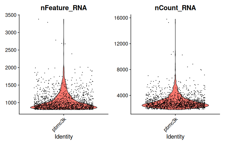
Exploring UMI count distribution per cell
Examining the distribution of total UMI counts per cell provides valuable insights into cell quality and sequencing depth. Cells with exceptionally low or high UMI counts may indicate poor quality or the presence of doublets, respectively.
# Display a statistical summary of the total UMI counts per cell
summary(sobj$nCount_RNA)

# Generate a violin plot of UMI counts per cell (linear scale)
p1 <- VlnPlot(
  sobj,
  features = "nCount_RNA",
  pt.size = 0,
  alpha = 0.1
) +
  geom_hline(yintercept = c(1800, 50000), linetype = "dashed", color = "red") +
  labs(title = "UMI counts per cell (linear scale)") +
  theme_minimal(base_size = 14) +
  theme(plot.title = element_text(hjust = 0.5))

# Generate a violin plot of UMI counts per cell (log-transformed)
p2 <- VlnPlot(
  sobj,
  features = "nCount_RNA",
  pt.size = 0,
  alpha = 0.1
) +
  scale_y_log10() +
  geom_hline(yintercept = c(1800, 50000), linetype = "dashed", color = "blue") +
  labs(title = "UMI counts per cell (log-transformed)") +
  theme_minimal(base_size = 14) +
  theme(plot.title = element_text(hjust = 0.5))

# Combine the two plots
p1 + p2
- Dashed red lines indicate tentative thresholds for identifying low-quality cells (below 1,800 UMIs) and extremely highly sequenced cells (above 50,000 UMIs).
- A log-transformation is applied to better visualize variations across a wide dynamic range.
Scatter plot (genes vs UMI)
# Create a scatter plot comparing:
# - Total UMI counts per cell (nCount_RNA) on the x-axis
# - Number of detected genes per cell (nFeature_RNA) on the y-axis
FeatureScatter(sobj, feature1 = "nCount_RNA", feature2 = "nFeature_RNA", pt.size = 0.1)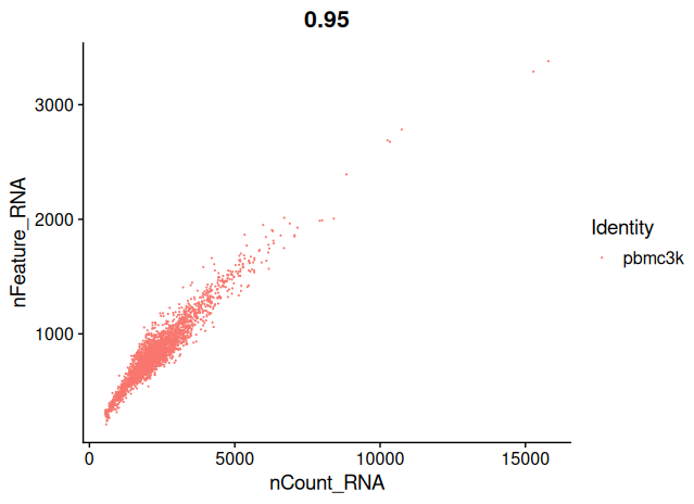
Your aim while looking at these graphs is to define the thresholds/cutoffs that you will apply to filter cells out. To do so, try to identify the cells that behave differently from the main population.
Memory management
After the Seurat object is created, the raw data matrix and temporary variables can be removed to optimize memory usage.
# Remove unused objects
rm(nb_umi_by_barcode, sc_data)

# Perform garbage collection to free memory
invisible(gc())
This step ensures an efficient R session, especially when working with larger datasets.
Filter out unwanted cells
Defining QC thresholds
Before filtering, threshold values must be defined based on key QC metrics such as the number of detected genes and total UMI counts per cell. These thresholds can be adjusted depending on the specific characteristics of the dataset.
The following cutoff values are commonly used in practice:
# Define cutoff values for cell filtering
minGene <- 200    # Minimum number of genes detected per cell
minUMI <- 1000 # Minimum total UMI count per cell- Minimum gene count (
minGene): Cells with fewer than 200 detected genes are typically excluded, as they often represent low-quality or empty droplets. - Minimum UMI count (
minUMI): Cells with fewer than 1,000 UMIs are similarly filtered out to remove poorly sequenced cells. Thresholds should be adapted based on the specific distribution of the dataset, as visualized in the previous diagnostic plots.
Filtering low-quality cells
Based on the defined QC thresholds, cells can now be filtered to retain only high-quality profiles. A new Seurat object is created to store the filtered dataset.
# Create a new Seurat object containing only filtered cells
sobj_filtrd <- subset(
  sobj,
  subset = nFeature_RNA > minGene & nCount_RNA > minUMI
)

# Visualize the distribution of key QC metrics after filtering
VlnPlot(
  sobj_filtrd,
  features = c("nFeature_RNA", "nCount_RNA"),
  ncol = 2
)
- Cells with fewer than 200 detected genes or fewer than 1,000 total UMIs are excluded.
- No upper threshold for gene count or UMI count is applied at this stage.
- The violin plots provide a post-filtering view of the distribution of genes and UMIs per cell.
Considerations on threshold selection
Defining thresholds for low- and high-quality cells remains an empirical process. There are currently no universally accepted guidelines, and practices vary:
- Some pipelines apply stringent thresholds, excluding cells with extremely high gene or UMI counts, based on observed distributions.
- Others prefer minimal manual filtering, retaining all barcodes above basic quality thresholds (200 genes and 1,000 UMIs) and rely on downstream automated doublet detection methods such as scDblFinder.
Thresholds can be adjusted based on:
- The overall sequencing depth and complexity of the dataset.
- The objectives of the study (e.g., maximizing sensitivity vs. ensuring purity).
- Observations made during exploratory data analysis.
In practice, it is often advisable to:
- Test multiple threshold settings,
- Perform the full downstream analyses,
- Evaluate the robustness of biological conclusions relative to the chosen thresholds.
Filtering based on mitochondrial RNA content
High levels of mitochondrial transcripts in scRNA-seq datasets often indicate dying or stressed cells. Therefore, evaluating and filtering based on mitochondrial content is a crucial step in quality control.
Calculation of mitochondrial content
First, the list of mitochondrial genes must be defined. In human datasets, mitochondrial genes typically begin with the prefix "MT-", whereas in mouse they start with "mt-".
# Define mitochondrial gene pattern based on species
species_value <- "human"
mito_pattern <- ifelse(species_value == "human", "^MT-", "^mt-")
The mitochondrial content per cell can then be computed using the PercentageFeatureSet function:
# Calculate the percentage of mitochondrial gene expression per cell
sobj_filtrd$percent_mt <- PercentageFeatureSet(sobj_filtrd, pattern = mito_pattern)

# Display a summary of mitochondrial content
summary(sobj_filtrd$percent_mt)
Visualization of mitochondrial content
The distribution of mitochondrial percentages across cells can be visualized as follows:
# Violin plot of mitochondrial percentage per cell
VlnPlot(sobj_filtrd, features = "percent_mt")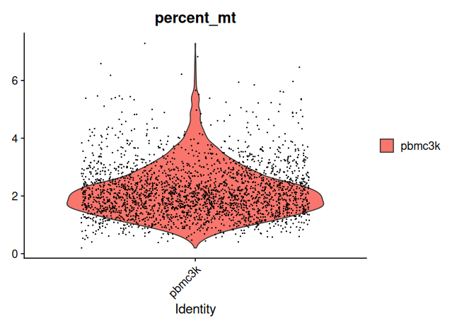
A histogram provides an additional perspective on the distribution:
# Histogram of mitochondrial content
qplot(
  sobj_filtrd$percent_mt,
  geom = "histogram",
  bins = 100,
  main = "Distribution of mitochondrial content",
  xlab = "Percent mitochondrial RNA"
)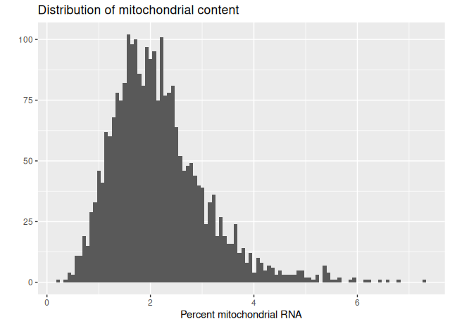
- The majority of cells display low to moderate mitochondrial content.
- A small fraction of cells shows elevated levels, which likely represents compromised or apoptotic cells.
Final quality filtering
To further refine the dataset, an additional filtering step can be applied based on mitochondrial content, as well as stricter thresholds on gene and UMI counts.
# Final filtering based on refined QC thresholds
sobj_filtrd <- subset(
  sobj_filtrd,
  subset = nFeature_RNA > 800 &
           nFeature_RNA < 6000 &
           nCount_RNA > 1800 &
           nCount_RNA < 50000 &
           percent_mt < 25
)

# Visualize QC metrics after final filtering
VlnPlot(sobj_filtrd, features = c("nFeature_RNA", "nCount_RNA"), ncol = 2)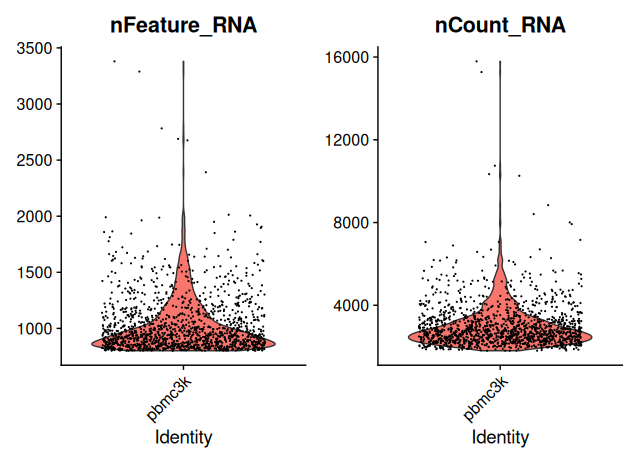
- Cells with excessive mitochondrial RNA (>25%) are excluded.
- Additional filters on gene and UMI counts are applied to further enrich for high-quality cells.
Overview of filtering results
# Quantify the effect of filtering
n_original <- ncol(sobj)
n_filtered <- ncol(sobj_filtrd)
n_removed <- n_original - n_filtered

cat("Original barcodes:", n_original, "\n")
cat("Barcodes after filtering:", n_filtered, "\n")
cat("Barcodes removed:", n_removed, "\n")
cat("Percentage removed:", round(100 * n_removed / n_original, 2), "%\n")
For the pbmc3k dataset:
- Original barcodes: 2,700
- Barcodes after filtering: 1,402
- Barcodes removed: 1,298
- Percentage removed: 48.07%
Approximately half of the initial barcodes were removed during quality filtering, primarily representing low-quality or ambiguous profiles.
Automatic identification of doublets/multiplets
Doublets or multiplets occur when two or more cells are captured within a single droplet. They can introduce artifacts into downstream analyses if not properly identified and removed. Several algorithms are available to predict doublets; here, we use the scDblFinder package.
Predicting doublets with scDblFinder
First, the Seurat object must be converted into a SingleCellExperiment object, which is the input format required by scDblFinder.
# Convert Seurat object to SingleCellExperiment format
sceobj <- as.SingleCellExperiment(sobj_filtrd)
Additional information about
SingleCellExperimentobjects is available at: https://www.bioconductor.org/packages/devel/bioc/vignettes/SingleCellExperiment/inst/doc/intro.html
Doublets are then predicted using scDblFinder:
# Run scDblFinder to predict doublets
doublet_res <- scDblFinder(sceobj)
Warnings regarding empty layers (data, scale.data) are expected at this stage because the dataset has not yet been normalized.
Once predicted, the results are added back into the Seurat object:
# Save doublet classification in the Seurat object
sobj_filtrd$doublets.class <- doublet_res$scDblFinder.class

# Display the number of predicted singlets and doublets
table(sobj_filtrd$doublets.class)
Approximately 3.1% of cells were classified as doublets.
Removing predicted doublets
Cells classified as doublets are excluded to retain only singlets:
# Subset to keep only singlets
sobj_filtrd <- subset(sobj_filtrd, subset = doublets.class == "singlet")

# Visualize QC metrics after doublet removal
VlnPlot(sobj_filtrd, features = c("nFeature_RNA", "nCount_RNA"), ncol = 2)
The violin plots confirm the quality of the retained cells after doublet removal.
Important considerations
While scDblFinder effectively identifies doublets, caution is advised:
- Transitional or mixed-lineage cells (early progenitors) may be falsely classified as doublets.
- Dividing cells in the G2/M phase of the cell cycle are sometimes misidentified.
If cell cycle-specific genes are available, the
CellCycleScoringfunction from Seurat can be used to calculate cell cycle phase scores and validate whether true biological states are incorrectly flagged.
Memory cleanup
To maintain an efficient R session, unused objects are removed:
# Remove intermediate objects
rm(sobj, sceobj, doublet_res)
invisible(gc())
Normalization
As we noticed in the previous graphs, the cells do not have the same number of total UMIs. This may reflect true biological differences (some cells express less RNA than other) but it’s likely to be the result of cell-specific sequencing bias (some cells have been less sequenced than other). The normalization step aims to correct for differences in sequencing depth across cells.
Log-normalization
In this tutorial, a global scaling normalization approach is applied. This method assumes that all cells have approximately equivalent RNA content.
The LogNormalize method in Seurat proceeds as follows:
- For each cell, gene expression counts are divided by the total UMI counts for that cell.
- The resulting values are multiplied by a scale factor (here, the median total UMI count across all cells).
- A natural logarithm transformation is applied. Normalization is performed with the following command:
# Normalize gene expression using LogNormalization
sobj_filtrd <- NormalizeData(
  sobj_filtrd,
  normalization.method = "LogNormalize",
  scale.factor = median(sobj_filtrd$nCount_RNA)
)
After normalization:
- The normalized expression matrix is stored in the
datalayer of the RNA assay. - Raw counts remain accessible in the
countslayer.
Identify cell populations
The goal of this section is to identify distinct subpopulations of cells based on their transcriptional profiles. This is achieved by grouping cells into clusters that share similar gene expression patterns. The standard clustering workflow consists of the following key steps:
- Selection of highly variable features (genes): identify genes that exhibit significant variability across cells.
- Dimensionality reduction: reduce the complexity of the data while preserving biological signal (typically using PCA).
- Graph-based clustering: construct a shared-nearest-neighbor graph to identify cell communities.
In this section, we will analyse further the data and try to identify sub-populations of cells. The objective is to create clusters of cells to make groups of cells that share similar expression profile.
The mains steps are as follow :
- Select a subset of genes to perform the downstream analyses (highly variable genes)
- Perform a dimension reduction (PCA)
- Cluster the cells
These steps are typically applied after log-normalization of the data using the NormalizeData() function.
Note:
If you used SCTransform (instead of the log-normalization), the steps NormalizeData(), FindVariableFeatures() and ScaleData() are already incorporated into the SCTransform pipeline.
In that case, you should proceed directly to dimensionality reduction and clustering using the SCT assay.
Select highly variables (HVGs)
To focus the analysis on biologically informative features, a subset of genes that exhibit the greatest variability across cells is selected. This step reduces noise from uninformative genes and improves the efficiency and accuracy of downstream dimensionality reduction and clustering.
Seurat provides the FindVariableFeatures() function for this purpose, using variance-stabilizing methods to rank genes by their dispersion.
# Identify highly variable genes using the 'vst' method
sobj_filtrd <- FindVariableFeatures(
  sobj_filtrd,
  selection.method = "vst",
  nfeatures = 2000,
  verbose = FALSE
)

# Retrieve the top 10 most variable genes
top10 <- head(VariableFeatures(sobj_filtrd), 10)- Typically, between 500 and 3000 genes are selected.
- In this case, 2000 genes are retained based on their standardized variance.
To inspect or export the complete list of selected highly variable genes:
# Access the complete list of variable genes
list_hvg <- VariableFeatures(sobj_filtrd)

# Optionally filter out missing values
list_hvg <- list_hvg[!is.na(list_hvg)]
The variable features are stored in the Seurat object and are automatically used by downstream functions such as ScaleData() and RunPCA().
Dimension reduction with PCA
Scaling
Before performing PCA, gene expression values are centered and scaled. This ensures that each gene contributes equally to the principal components, regardless of its expression level.
# Scale and center the data
sobj_filtrd <- ScaleData(sobj_filtrd)- By default, scaling is applied only to the previously identified variable genes.
- Each gene is transformed to have a mean of zero and a standard deviation of one across all cells.
Note:
If using SCTransform, this step is not required. The SCTransform() function internally performs normalization, variance stabilization and scaling.
Run PCA
Although variable gene selection reduces dimensionality, further compression is necessary. Principal Component Analysis (PCA) identifies the major axes of variation in the data and projects cells into this lower-dimensional space.
# Perform PCA using the variable features identified earlier
sobj_filtrd <- RunPCA(
  sobj_filtrd,
  features = VariableFeatures(object = sobj_filtrd)
)
This process:
- Projects each cell into a coordinate system defined by principal components.
- Reduces the high-dimensional gene expression matrix to a compact representation capturing major transcriptional variation.
Alternative methods for dimensionality reduction include:
- ICA (Independent Component Analysis)
- ZIFA, pCMF: single-cell–specific methods addressing overdispersion
Accessing key data layers & Seurat object manipulation
# Extract normalized (log-transformed) data
normalized_data <- GetAssayData(sobj_filtrd, assay = "RNA", layer = "data")
head(normalized_data[1:5, 1:5])

# Extract scaled data
scaled_data <- GetAssayData(sobj_filtrd, assay = "RNA", layer = "scale.data")
head(scaled_data[1:5, 1:5])

# Extract the list of variable genes
variable_genes <- VariableFeatures(sobj_filtrd)
head(variable_genes)

# Extract PCA embeddings (first two components)
pca_embeddings <- Embeddings(sobj_filtrd, reduction = "pca")[, 1:2]
head(pca_embeddings)
These components are automatically used by downstream Seurat functions, such as clustering and visualization.
Explore the PCA results
Once PCA is completed, it is informative to examine the genes contributing most to each principal component. These gene loadings reflect patterns of co-expression and can provide insight into biological processes driving variability in the dataset.
Seurat provides several tools for PCA interpretation:
# Display top genes driving each of the first 5 principal components
print(sobj_filtrd[["pca"]], dims = 1:5, nfeatures = 5)

# Visualize loadings for a specific principal component
VizDimLoadings(sobj_filtrd, dims = 3, reduction = "pca")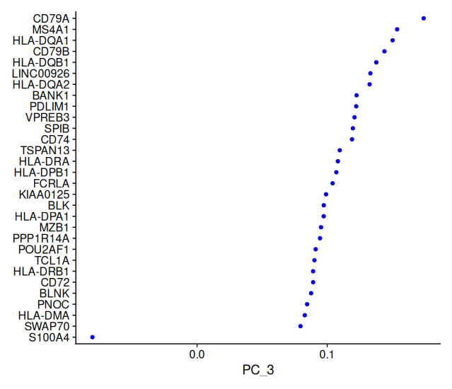
print()shows the top positive and negative genes driving each PC.VizDimLoadings()plots how much each gene contributes to the selected PC.
# Visualize expression of top genes across cells for the first 5 PCs
DimHeatmap(sobj_filtrd, dims = 1:5)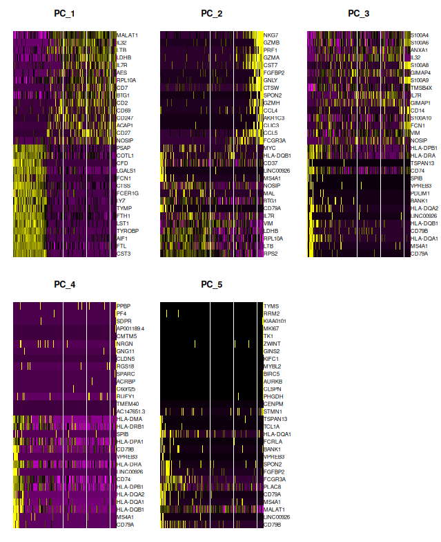
DimHeatmap()reveals expression patterns of top-contributing genes, helping detect structured heterogeneity. These options are particularly helpful for associating PCs with biological signals.
Choose the number of axes
Determining the appropriate number of PCs to retain is crucial for downstream clustering and UMAP projection. Using too few PCs risks merging distinct subpopulations; using too many may introduce noise and lead to spurious clusters.
# PCA projection of cells
DimPlot(sobj_filtrd, reduction = "pca")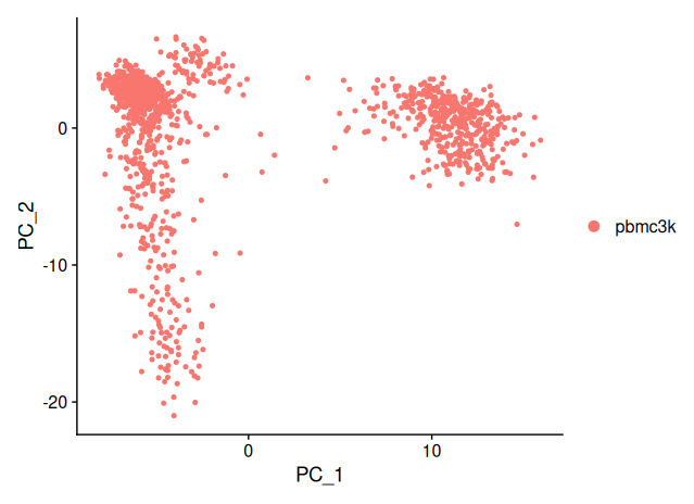
This scatterplot displays each cell in the PC1–PC2 space. Clustering tendencies or trajectories may be visually inferred even before formal clustering is applied.
An elbow plot visualizes the percentage of variance explained by each PC and helps identify the optimal cutoff.
# Generate an elbow plot to assess variance explained
ElbowPlot(sobj_filtrd, ndims = 50)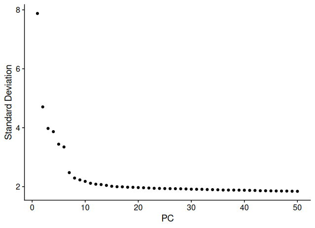
In the elbow plot:
- A sharp drop is observed up to PC 7–8, suggesting a strong contribution of these PCs.
- Minor inflections are visible around PC 20.
- Beyond PC 30, the explained variance plateaus, meaning low marginal contribution to variance.
In this tutorial, we proceed using the default of 10 principal components, while noting that increasing this number (to 20 or 30) can be explored to evaluate the effect on clustering resolution and stability.
Clustering
To group transcriptionally similar cells into discrete populations, Seurat uses a graph-based clustering approach that operates on PCA-reduced data.
There are two main steps to cluster the cells:
- Construct a Shared Nearest Neighbor (SNN) graph:
- For each cell, Seurat identifies its k nearest neighbors in PCA space (default k = 20).
- The distance between cells is calculated using the coordinates obtained with the PCA.
- Apply community detection algorithms (Louvain or Leiden)
- The graph is partitioned into clusters based on modularity optimization.
- The granularity of the clustering is controlled by the
resolutionparameter: the higher the value of the parameter is, the more groups you will get.
Graph-based clustering (SNN, Louvain/Leiden)
# Define the number of principal components to use
nPC <- 10

# Build the SNN graph
sobj_filtrd <- FindNeighbors(sobj_filtrd, dims = 1:nPC)

# Cluster cells using multiple resolutions
sobj_filtrd <- FindClusters(sobj_filtrd, resolution = c(0.1, 0.2, 0.5, 1, 2))

# View the metadata table to confirm clustering results are stored
head(sobj_filtrd@meta.data)- The clustering results are stored as additional columns in the layer
metadata:RNA_snn_res.0.1,RNA_snn_res.0.2, etc.
- Each column corresponds to a different resolution setting.
Inspecting cluster assignments
# Check number of cells per cluster for specific resolutions
table(sobj_filtrd[["RNA_snn_res.0.1"]])
table(sobj_filtrd[["RNA_snn_res.0.5"]])
Higher resolution values yield more fine-grained clusters; lower values produce coarser groupings.
Visualize clusters with UMAP
To visualize clustering results, Seurat uses UMAP. It’s a non-linear dimensionality reduction technique which preserve local relationships between cells, making clusters more visually separable.
# Run UMAP using the same number of PCs
sobj_filtrd <- RunUMAP(sobj_filtrd, dims = 1:nPC)
Specify which clustering resolution to visualize:
# Set the active identity class to the desired clustering resolution
Idents(sobj_filtrd) <- "RNA_snn_res.0.5"

# Plot clusters in UMAP space
DimPlot(sobj_filtrd, reduction = "umap")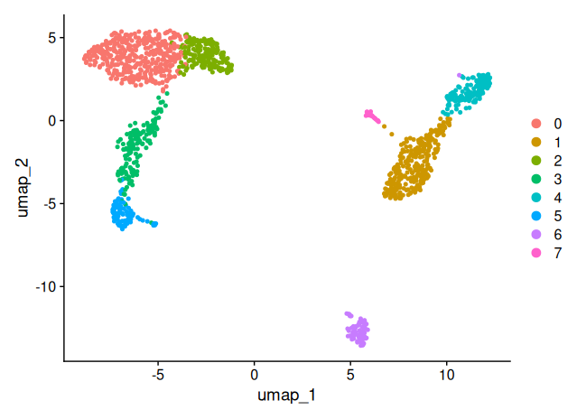
Important: UMAP is a visualization tool, a representation. The distances between clusters should not be over-interpreted quantitatively.
Customize UMAP projection
The appearance of UMAP can be adjusted using key parameters:
n.neighbors: controls the size of the local neighborhood used for learning structure.min.dist: controls the tightness of clusters in the 2D embedding.
# Generate a custom UMAP projection
sobj_filtrd <- RunUMAP(sobj_filtrd, dims = 1:nPC, n.neighbors = 15, min.dist = 0.8)
DimPlot(sobj_filtrd, reduction = "umap", label = TRUE, label.size = 6)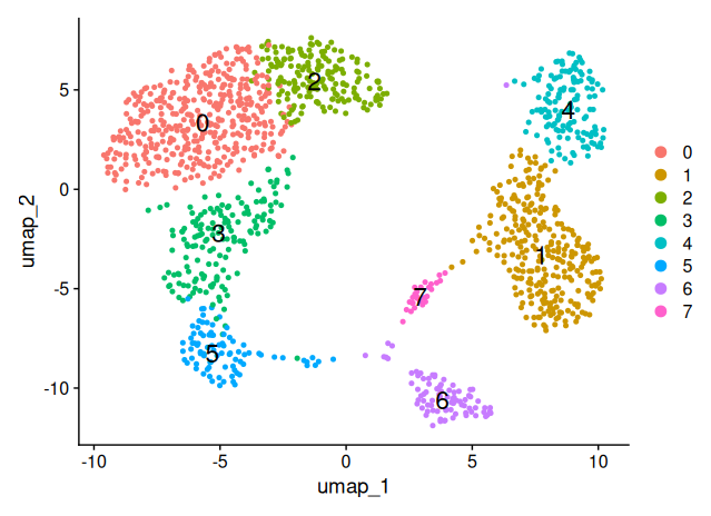
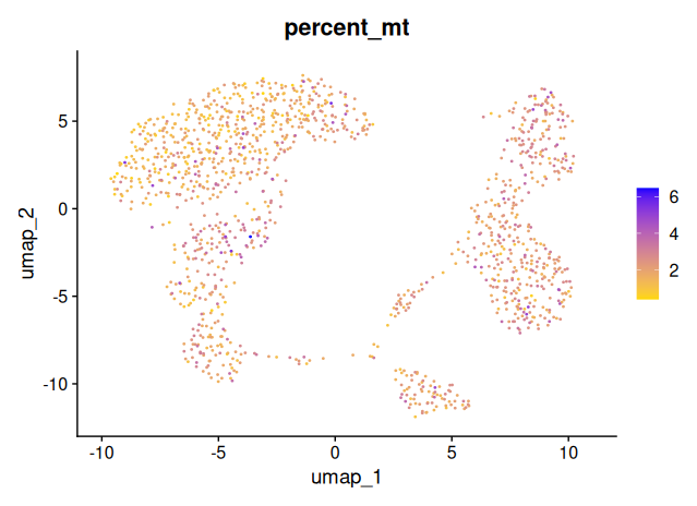
Checking for technical or biological biases
Once clustering is complete, it is important to assess whether non-biological factors (sequencing depth, mitochondrial content, cell cycle state, …) are influencing the clustering structure.
Visualize technical metrics on UMAP
Three key metrics should be overlaid on the UMAP to assess whether they co-vary with clusters:
percent_mt: mitochondrial RNA contentnCount_RNA: total UMI count per cellnFeature_RNA: number of detected genes per cell
# Plot percent mitochondrial reads on UMAP
FeaturePlot(
  object = sobj_filtrd,
  reduction = "umap",
  features = "percent_mt",
  cols = c("gold", "blue"),
  pt.size = 0.2,
  order = TRUE
)
# Plot total UMI counts per cell
FeaturePlot(
  object = sobj_filtrd,
  reduction = "umap",
  features = "nCount_RNA",
  cols = c("gold", "blue"),
  pt.size = 0.2,
  order = TRUE
)
# Plot number of genes detected per cell
FeaturePlot(
  object = sobj_filtrd,
  reduction = "umap",
  features = "nFeature_RNA",
  cols = c("gold", "blue"),
  pt.size = 0.2,
  order = TRUE
)
If certain clusters show elevated
percent_mt, lownFeature_RNAor lownCount_RNA, this could indicate that the clusters are driven by technical noise, rather than true biological differences.
These UMAP projections show relatively even distributions across the embedding space, with no clusters exclusively driven by high mitochondrial content or sequencing depth.
This suggests that:
- The clustering is not dominated by low-quality cells or library size differences.
- the earlier filtering steps were effective in minimizing technical artifacts.
(Optional) Checking for cell cycle effects
The cell cycle can have a pronounced effect on the transcriptome and may influence clustering results.
To control for this:
- Seurat provides the
CellCycleScoring()function. - Alternative methods such as Scran’s
cyclonecan also be used to assign cell cycle phases.
These methods compute G1, S and G2/M phase scores, which can then be used to regress out cell cycle effects or visualize potential bias.
# Example (not run):
# sobj_filtrd <- CellCycleScoring(sobj_filtrd, s.features = s.genes, g2m.features = g2m.genes)
# FeaturePlot(sobj_filtrd, features = "Phase", reduction = "umap")
Cell type annotation
We’ve now successfully clustered the cells!
Now begins the biological interpretation: identifying what cell types each cluster represents. In this section, we’ll perform manual annotation using known marker genes, followed by quantitative scoring.
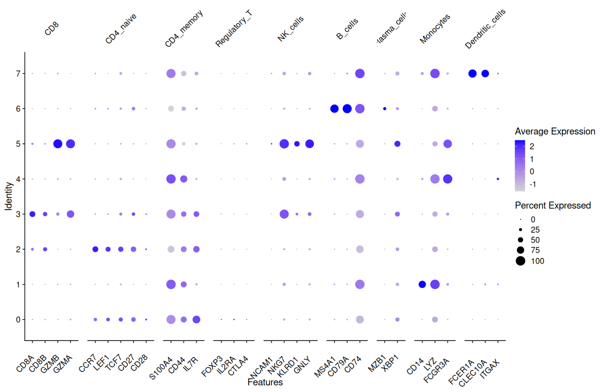
Manual annotation using marker genes
Define marker lists
Below we define sets of known cell-type–specific marker genes. These are used for manual inspection and annotation.
marker_genes <- list(
  CD8 = c("CD8A", "CD8B", "GZMB", "GZMA"),
  CD4_naive = c("CCR7", "LEF1", "TCF7", "CD27", "CD28"),
  CD4_memory = c("S100A4", "CD44", "IL7R"),
  Regulatory_T = c("FOXP3", "IL2RA", "CTLA4"),
  NK_cells = c("NCAM1", "NKG7", "KLRD1", "GNLY"),
  B_cells = c("MS4A1", "CD79A", "CD74"),
  Plasma_cells = c("MZB1", "XBP1"),
  Monocytes = c("CD14", "LYZ", "FCGR3A"),
  Dendritic_cells = c("FCER1A", "CLEC10A", "ITGAX")
)

# Keep only markers present in the dataset
marker_genes <- lapply(marker_genes, function(g) intersect(g, rownames(sobj_filtrd)))
Visualize marker expression
Visual inspection of expression patterns helps match clusters with cell types.
# Violin plots for one marker set
VlnPlot(sobj_filtrd, features = marker_genes$CD8)
# UMAP overlays for the same markers
FeaturePlot(sobj_filtrd, features = marker_genes$CD8)
To explore all cell types at once:
# Dot plot across all clusters
DotPlot(sobj_filtrd, features = marker_genes) +
  theme(
    axis.text.x = element_text(angle = 45, vjust = 0.5, hjust = 1),
    strip.text = element_text(angle = 45, hjust = 0.5)
  )
Rename clusters based on marker profiles
Once we have identified which markers are enriched in each cluster, you can manually rename the clusters for interpretability:
# Preview cluster labels
levels(sobj_filtrd)

# Modify this block to match your interpretation
new.cluster.ids <- c(
  "CD4_memory", # Strong expression of memory markers (S100A4, CD44) -> cluster 0
  "Monocytes", # High CD14 and FCGR3A -> cluster 1
  "CD4_naive", # High CCR7, CD27, CD28 -> cluster 2
  "CD8", # High CD8A, CD8B, GZMB -> cluster 3
  "Regulatory_T", # Low expression overall, slight FOXP3/IL2RA signal -> cluster 4
  "NK_cells", # Strong NKG7, GNLY, KLRD1 -> cluster 5
  "B_cells", # High MS4A1, CD79A, CD74 -> cluster 6
  "Dendritic_cells" # Strong FCER1A, CLEC10A, ITGAX -> cluster 7
)

# Assign names based on current cluster levels
names(new.cluster.ids) <- levels(sobj_filtrd)

# Rename identities
sobj_filtrd <- RenameIdents(sobj_filtrd, new.cluster.ids)

# Confirm new labels
head(sobj_filtrd@active.ident)
Idents(sobj_filtrd)
DimPlot(sobj_filtrd, reduction = "umap", label = TRUE)
DimPlot(sobj_filtrd, reduction = "umap", label = TRUE, label.box = TRUE) # add label box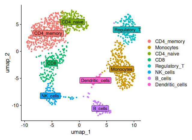
Using canonical marker genes and DotPlot visualization, we annotated the eight identified clusters into distinct immune cell populations. Cluster 3 showed high expression of CD8A, CD8B and GZMB, consistent with CD8+ T cells. Cluster 2 expressed CCR7, CD27 and CD28, identifying it as naïve CD4+ T cells, while cluster 0 was enriched for S100A4 and CD44, characteristic of CD4 memory T cells. Cluster 1 displayed strong expression of CD14 and FCGR3A, typical of monocytes, and cluster 6 expressed MS4A1, CD79A and CD74, marking it as B cells. Cluster 5 showed robust NKG7, GNLY and KLRD1 expression, classifying it as NK cells. Cluster 4 had weak expression of FOXP3 and IL2RA, suggesting a population of regulatory T cells. Finally, cluster 7 showed strong expression of FCER1A, CLEC10A and ITGAX, clearly identifying it as dendritic cells.
Score cells using gene modules
We can assign a module score to each cell based on its expression of each marker set using AddModuleScore():
sobj_filtrd <- AddModuleScore(
  object = sobj_filtrd,
  features = marker_genes,
  nbin = 5,
  seed = 1,
  ctrl = length(marker_genes),
  name = "program"
)

# Rename generic "program1", "program2" to their respective labels
vec_rename <- paste0("program", seq_along(marker_genes))
names(vec_rename) <- names(marker_genes)

sobj_filtrd@meta.data <- sobj_filtrd@meta.data %>%
  dplyr::rename(all_of(vec_rename))
Explore module scores visually:
# Loop through marker sets and visualize scores
for (f in names(marker_genes)) {
  print(VlnPlot(sobj_filtrd, features = f))
  print(FeaturePlot(sobj_filtrd, features = f))
}
Automatic annotation
In some cases, the different cell types have already been largely described and databases exist with lists of referenced marker genes or datasets. This is particularly true for human and mouse. For well-characterized tissues, the manual annotation may be replaced or supported by automated annotation tools, which compare the data to reference datasets.
Instead of manual annotation, these datasets (PanglaoDB, CellMarker) can be used, along with published tools (SingleR, CelliD, celldex) to call the cell types in the data. This process is called automatic annotation.
These methods can quickly assign cell types and help validate the manual curation.
Differential expression
Differential expression will help you to validate your clusters. By default you can use Wilcoxon test, but if you have several replicates package such as DESeq2 are more appropriate.
To validate clustering results and begin annotating cell types, we perform differential expression analysis across clusters.
Seurat provides the FindAllMarkers() function, which performs pairwise comparisons between each cluster and all others.
Run differential expression
Here, we use the Wilcoxon rank-sum test (default) to identify genes that are significantly upregulated in each cluster:
# Identify differentially expressed genes (DEGs) for all clusters
# min.pct = 0.2 ensures only genes expressed in ≥20% of cells in either group are tested
result.DE <- FindAllMarkers(sobj_filtrd, min.pct = 0.2)

# Preview results
head(result.DE, n = 5)
This returns a data frame with:
gene: gene namecluster: cluster numberavg_log2FC: average log fold-changepct.1andpct.2: percent of cells expressing the gene in the target vs. comparison groupp_val_adj: adjusted p-value
Visualize results
To visually assess the specificity and expression pattern of top DE genes, we create a clustered heatmap:
# Select top 50 DE genes, sorted by expression prevalence
top.DE <- head(result.DE, 50)
top.DE <- top.DE[order(top.DE$pct.1, decreasing = TRUE), ]

# Plot heatmap of log-normalized expression values
DoHeatmap(
  subset(sobj_filtrd),
  features = rownames(top.DE),
  slot = "data",
  size = 3
)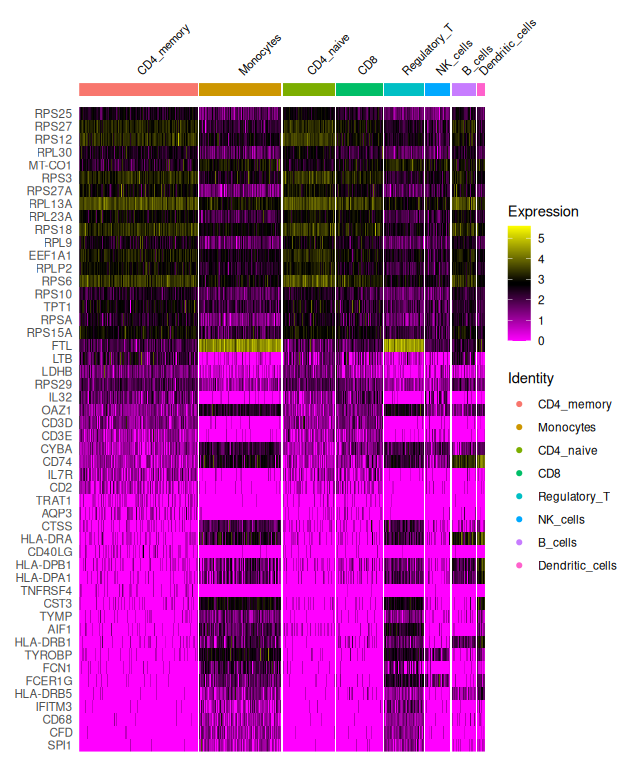
The heatmap illustrates cluster-specific gene expression patterns, helping identify candidate marker genes for downstream cluster annotation.
The clustered heatmap shows the top 50 differentially expressed genes across clusters, grouped by their assigned identity. This type of plot is extremely useful for:
- Validating clustering results: are clusters transcriptionally distinct?
- Identifying candidate marker genes: which genes are highly expressed in only one group?
- Guiding annotation: comparing gene signatures to known cell types
Each row is a gene; each column is a cell; expression levels are color-coded (log-transformed), ranging from low (magenta) to high (yellow).
In this example, we observe:
- CD4 and CD8 T cell subsets with expression of CD3D, IL7R, CD8A
- Monocytes enriched for LYZ, S100A8, FCN1
- NK cells expressing GNLY, NKG7
- B cells with MS4A1, CD79A
- Dendritic cells expressing CST3, FCER1A
Notes on statistical testing
By default, Seurat uses the Wilcoxon test, which is well-suited to single-cell data. If your data includes biological replicates or batches, consider using:
DESeq2(pseudo-bulk or aggregate level)edgeR,MASTorlimmafor more complex designs Always interpret DE results in the context of cluster size, QC and batch structure.
Save the processed Seurat object
# Save the filtered and clustered Seurat object
saveRDS(sobj_filtrd, file = paste0(sample.name, "_FILTERED_CLUSTERS.rds"))
The saved
.rdsfile includes all clustering, dimensionality reduction and expression data.
Session info
# Display session info for reproducibility
sessionInfo()
R version 4.4.2 (2024-10-31)
Platform: x86_64-pc-linux-gnu
Running under: Ubuntu 24.04.2 LTS
Matrix products: default
BLAS: /usr/lib/x86_64-linux-gnu/openblas-pthread/libblas.so.3
LAPACK: /usr/lib/x86_64-linux-gnu/openblas-pthread/libopenblasp-r0.3.26.so; LAPACK version 3.12.0
locale:
[1] LC_CTYPE=en_US.UTF-8 LC_NUMERIC=C LC_TIME=fr_FR.UTF-8 LC_COLLATE=en_US.UTF-8 LC_MONETARY=fr_FR.UTF-8
[6] LC_MESSAGES=en_US.UTF-8 LC_PAPER=fr_FR.UTF-8 LC_NAME=C LC_ADDRESS=C LC_TELEPHONE=C
[11] LC_MEASUREMENT=fr_FR.UTF-8 LC_IDENTIFICATION=C
time zone: Europe/Paris
tzcode source: system (glibc)
attached base packages:
[1] grid stats4 stats graphics grDevices utils datasets methods base
other attached packages:
[1] scDblFinder_1.20.2 Matrix_1.7-2 future_1.34.0 ComplexHeatmap_2.22.0 celldex_1.16.0
[6] tidyr_1.3.1 dplyr_1.1.4 cowplot_1.1.3 patchwork_1.3.0 pheatmap_1.0.12
[11] viridis_0.6.5 viridisLite_0.4.2 ggplot2_3.5.1 SingleR_2.8.0 SingleCellExperiment_1.28.1
[16] SummarizedExperiment_1.36.0 Biobase_2.66.0 GenomicRanges_1.58.0 GenomeInfoDb_1.42.3 IRanges_2.40.1
[21] S4Vectors_0.44.0 BiocGenerics_0.52.0 MatrixGenerics_1.18.1 matrixStats_1.5.0 DoubletFinder_2.0.4
[26] hdf5r_1.3.12 Seurat_5.2.1 SeuratObject_5.0.2 sp_2.2-0
loaded via a namespace (and not attached):
[1] bitops_1.0-9 spatstat.sparse_3.1-0 httr_1.4.7 RColorBrewer_1.1-3 doParallel_1.0.17
[6] tools_4.4.2 sctransform_0.4.1 alabaster.base_1.6.1 utf8_1.2.4 R6_2.6.1
[11] HDF5Array_1.34.0 lazyeval_0.2.2 uwot_0.2.2 rhdf5filters_1.18.0 GetoptLong_1.0.5
[16] withr_3.0.2 gridExtra_2.3 progressr_0.15.1 cli_3.6.4 spatstat.explore_3.3-4
[21] fastDummies_1.7.5 labeling_0.4.3 alabaster.se_1.6.0 spatstat.data_3.1-4 ggridges_0.5.6
[26] pbapply_1.7-2 Rsamtools_2.22.0 R.utils_2.12.3 scater_1.34.1 parallelly_1.42.0
[31] limma_3.62.2 rstudioapi_0.17.1 RSQLite_2.3.9 BiocIO_1.16.0 generics_0.1.3
[36] shape_1.4.6.1 ica_1.0-3 spatstat.random_3.3-2 ggbeeswarm_0.7.2 abind_1.4-8
[41] R.methodsS3_1.8.2 lifecycle_1.0.4 edgeR_4.4.2 yaml_2.3.10 rhdf5_2.50.2
[46] SparseArray_1.6.1 BiocFileCache_2.14.0 Rtsne_0.17 blob_1.2.4 dqrng_0.4.1
[51] promises_1.3.2 ExperimentHub_2.14.0 crayon_1.5.3 miniUI_0.1.1.1 lattice_0.22-5
[56] beachmat_2.22.0 KEGGREST_1.46.0 metapod_1.14.0 pillar_1.10.1 knitr_1.49
[61] rjson_0.2.23 xgboost_1.7.9.1 future.apply_1.11.3 codetools_0.2-19 glue_1.8.0
[66] spatstat.univar_3.1-1 data.table_1.16.4 vctrs_0.6.5 png_0.1-8 gypsum_1.2.0
[71] spam_2.11-1 gtable_0.3.6 cachem_1.1.0 xfun_0.51 S4Arrays_1.6.0
[76] mime_0.12 survival_3.8-3 iterators_1.0.14 bluster_1.16.0 statmod_1.5.0
[81] fitdistrplus_1.2-2 ROCR_1.0-11 nlme_3.1-167 bit64_4.6.0-1 alabaster.ranges_1.6.0
[86] filelock_1.0.3 RcppAnnoy_0.0.22 rprojroot_2.0.4 irlba_2.3.5.1 vipor_0.4.7
[91] KernSmooth_2.23-26 colorspace_2.1-1 DBI_1.2.3 ggrastr_1.0.2 tidyselect_1.2.1
[96] bit_4.5.0.1 compiler_4.4.2 curl_6.2.1 httr2_1.1.0 BiocNeighbors_2.0.1
[101] DelayedArray_0.32.0 plotly_4.10.4 rtracklayer_1.66.0 scales_1.3.0 lmtest_0.9-40
[106] rappdirs_0.3.3 stringr_1.5.1 digest_0.6.37 goftest_1.2-3 presto_1.0.0
[111] spatstat.utils_3.1-2 alabaster.matrix_1.6.1 rmarkdown_2.29 XVector_0.46.0 htmltools_0.5.8.1
[116] pkgconfig_2.0.3 sparseMatrixStats_1.18.0 dbplyr_2.5.0 fastmap_1.2.0 rlang_1.1.5
[121] GlobalOptions_0.1.2 htmlwidgets_1.6.4 UCSC.utils_1.2.0 shiny_1.10.0 DelayedMatrixStats_1.28.1
[126] farver_2.1.2 zoo_1.8-12 jsonlite_1.9.0 BiocParallel_1.40.0 R.oo_1.27.0
[131] RCurl_1.98-1.17 BiocSingular_1.22.0 magrittr_2.0.3 scuttle_1.16.0 GenomeInfoDbData_1.2.13
[136] dotCall64_1.2 Rhdf5lib_1.28.0 munsell_0.5.1 Rcpp_1.0.14 reticulate_1.40.0
[141] stringi_1.8.4 alabaster.schemas_1.6.0 zlibbioc_1.52.0 MASS_7.3-64 AnnotationHub_3.14.0
[146] plyr_1.8.9 parallel_4.4.2 listenv_0.9.1 ggrepel_0.9.6 deldir_2.0-4
[151] Biostrings_2.74.1 splines_4.4.2 tensor_1.5 circlize_0.4.16 locfit_1.5-9.11
[156] igraph_2.1.4 spatstat.geom_3.3-5 RcppHNSW_0.6.0 reshape2_1.4.4 ScaledMatrix_1.14.0
[161] XML_3.99-0.18 BiocVersion_3.20.0 evaluate_1.0.3 scran_1.34.0 BiocManager_1.30.25
[166] foreach_1.5.2 httpuv_1.6.15 RANN_2.6.2 purrr_1.0.4 polyclip_1.10-7
[171] clue_0.3-66 scattermore_1.2 rsvd_1.0.5 xtable_1.8-4 restfulr_0.0.15
[176] RSpectra_0.16-2 later_1.4.1 tibble_3.2.1 GenomicAlignments_1.42.0 memoise_2.0.1
[181] beeswarm_0.4.0 AnnotationDbi_1.68.0 cluster_2.1.8 globals_0.16.3 here_1.0.1